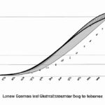
Calculating the Lorenz curve involves plotting cumulative income against the cumulative population. It depicts income inequality, visually showing the wealth distribution among a population. The closer the curve is to the line of perfect equality, the more evenly wealth is distributed. To calculate the Lorenz curve, divide the cumulative income by the total income. The resulting curve provides insights into the income disparity within a society. It is a critical tool for policymakers to gauge the effectiveness of redistribution policies and assess overall economic equity. Understanding the Lorenz curve is essential for addressing income inequality and creating a fairer society.
Table of Contents
- Calculating the Gini coefficient from the Lorenz curve
- Construction of the Lorenz curve
- Definition of the Lorenz curve
- Interpretation and significance of the Lorenz curve
- Purpose of the Lorenz curve
(Gini Coefficient and Lorenz Curve)
The Lorenz curve is a graphical representation of income distribution within a population. It helps analyze inequality. To calculate the Lorenz curve, first, arrange individuals by income. Then, calculate the cumulative percentage of income by each individual. Plot the cumulative percentage of income against the cumulative percentage of the population. The diagonal line represents perfect income equality. The further the Lorenz curve from this line, the greater the income inequality. Visual examination of the curve indicates distribution characteristics. The Gini coefficient, derived from the Lorenz curve, quantifies income inequality. A Gini coefficient of 0 represents perfect equality, while 1 signifies extreme inequality. The Lorenz curve provides insights for policymakers and economists to address income inequality. Understanding the curve’s shape guides decision-making regarding redistributive policies. Analyzing income distribution helps in devising strategies to ensure fair and equitable economic growth. By comprehensively studying the Lorenz curve, societies can work towards achieving a more just and inclusive economic system. The calculation of the Lorenz curve sheds light on societal disparities and fosters discussions on wealth distribution.
Calculating the Gini coefficient from the Lorenz curve
Calculating the Gini coefficient from the Lorenz curve is like unraveling a mystery that reveals the inequality lurking beneath the surface of statistical data. Imagine you have this beautifully drawn Lorenz curve, a visual representation of income distribution among individuals or households in an economy. The curve bends and weaves, showing who has what share of the total income.
To determine the Gini coefficient from this intricate web of lines and points, you venture on a journey through numbers and formulas. You start by plotting percentages of cumulative population against percentages of cumulative income on graph paper with care, forming this elegant curve that mirrors society’s economic landscape.
As you gaze at this Lorenz curve, you can’t help but feel a twinge of unease at what it signifies – disparities in wealth that exist all around us. Each bend in the line speaks volumes about how resources are distributed unevenly among people, painting a vivid picture of privilege and deprivation.
Now comes the moment where you transition from admiration to analysis by calculating the Gini coefficient – a single number that encapsulates all these nuances into a measure of inequality ranging from 0 (perfect equality) to 1 (maximum inequality). It’s like distilling complex societal dynamics into a digestible figure – simple yet profound in its implications.
You dive deep into your calculations, applying mathematical rigor to derive this crucial metric. By integrating areas under the Lorenz curve using integrals or other numerical methods, you tease out the Gini coefficient like extracting hidden treasure buried within data points and lines.
With each calculation step, there’s an anticipation building up as you inch closer to unraveling how unequal – or equal – society truly is based on empirical evidence rather than mere conjecture. Emotions run high as you grapple with significance behind every decimal point revealed by your computations.
In conclusion,
the process isn’t just about crunching numbers; it’s about understanding human condition reflected in statistics: joy alongside despair,
fortune intertwined with adversity—bringing empathy to bear on objective analysis.
So when next faced
with calculating
Gini coefficient remember it’s not just math—it’s humanity laid bare before our eyes.
Construction of the Lorenz curve
Constructing the Lorenz curve is like painting a picture that captures the essence of income distribution in society. Imagine standing in front of a blank canvas, armed with data points representing different percentiles of income earners. Each brushstroke represents an increasing percentage of total income earned, creating a visual representation of economic inequality.
First, you gather your data points – perhaps from a survey or census information – plotting them on a graph with cumulative percentages on the x-axis and cumulative income shares on the y-axis. The lowest-income earners start at the bottom left corner, while the highest-income individuals reside at the top right.
As you connect these dots with gentle arcs, a line begins to take shape – curving gently at first before steepening as it approaches its destination. This line is more than just ink on paper; it symbolizes real people’s livelihoods and opportunities.
The beauty of constructing this curve lies in its ability to convey complex societal issues in a single image. With each stroke of your pen, you are telling a story about wealth disparities and economic inclusivity. It’s both exhilarating and humbling to witness how numbers can transform into something so profound.
Yet, amidst this artistic process, there is also frustration. The stark reality depicted by the curve can be disheartening – revealing drastic gaps between rich and poor that persist despite efforts for equality. It tugs at your emotions, igniting empathy for those less fortunate while fueling determination to advocate for change.
Finally, when all points have been connected and every detail perfected, you step back to admire your creation: the Lorenz curve in all its glory. Its elegant curvature speaks volumes about social justice and financial equity; it stands as both a testament to current realities and a call to action for future generations.
In conclusion, constructing the Lorenz curve transcends mere mathematics – it embodies hopes, dreams, struggles, and triumphs woven into society’s fabric. As you gaze upon its final form, remember that behind every data point lies a human story waiting to be heard.
Definition of the Lorenz curve
Imagine you’re at a party, and someone brings up the topic of income inequality. Suddenly, everyone is nodding their heads in agreement or shaking them in disbelief over how wealth is distributed among people. This is where the Lorenz curve comes into play—it’s like a visual representation that unveils the disparity hiding beneath economic data.
The Lorenz curve was named after Max O. Lorenz, an American economist who introduced it back in 1905 to analyze income distribution. Picture a graph with two axes; on the horizontal axis sits cumulated proportions of households—ranging from the poorest to the richest—and on the vertical axis lies cumulated proportions of total income they receive.
As you trace this curve, your eyes will likely encounter its distinctive shape—a line bending below a perfectly equal distribution to reveal society’s actual wealth gap. The further away this curve strays from equality (the diagonal line representing perfect equality), the steeper becomes our realization of unequal shareholding.
In simpler terms, if we were living in an idealistic world with equal earnings for all, then our Lorenz curve would align perfectly along that diagonal line. However, reality paints a different picture as most curves tend to bow sharply away from parity before reaching equilibrium somewhere down the road.
Now imagine standing at any point along this arc-like graph—the closer you are towards its origin means less financial strain while venturing farther signifies rising monetary burdens borne solely by certain clusters within society.
Emotions may run high as you grasp how some individuals hold substantial chunks of resources compared to others struggling just to make ends meet – these feelings often trigger impassioned discussions about fairness and social justice.
From those conversations emerge collective yearnings for policies ensuring more equitable wealth redistribution or creating opportunities leveling out disparities illustrated vividly through every bend and slope of that captivating Lorenz curve.
Next time someone mentions social disparities or uneven riches at your gathering, bring up Max O. Lorenz and his eponymous graphical depiction—they might find themselves intrigued by what lies behind those curving lines encapsulating societal fortunes!
(Lorenz Curve and Gini Coefficient – Measures of Income Inequality)
Interpretation and significance of the Lorenz curve
The Lorenz curve, a powerful tool in economics, illustrates income distribution within a population. Picture this: imagine all the people in your country lined up from the poorest to the richest, with their corresponding incomes plotted on a graph. The curved line that forms represents how unevenly or evenly wealth is distributed among them.
When you look at the Lorenz curve for any given society, it can evoke various emotions – empathy for those struggling at the bottom and admiration for those thriving near the top. This visual representation goes beyond numbers; it tells stories of privilege and hardship, success and adversity.
The significance of interpreting the Lorenz curve lies in its ability to reveal inequalities that exist within a community. For instance, if the curve hugs closely to the 45-degree line (known as perfect equality), it signals an even distribution of wealth where everyone earns an equal share. On the other hand, if the curve bows far away from that ideal line towards one corner of the graph (representing perfect inequality), it highlights extreme economic disparity between individuals.
Analyzing these curves allows policymakers and economists to gauge societal well-being accurately. They can pinpoint areas requiring intervention – whether through progressive taxation policies or targeted social programs aimed at uplifting disadvantaged groups. It’s not just about numbers but about improving people’s lives by addressing systemic imbalances revealed by these curves.
Moreover, witnessing shifts in Lorenz curves over time can elicit hope or concern depending on which direction they move. A curve moving closer towards perfect equality signifies progress towards fairer wealth distribution—an encouraging sight reflecting positive changes benefiting more members of society.
Conversely, observing a widening gap between what each segment of society earns might stir feelings of injustice or disappointment—prompting urgent calls for reforms to bridge this growing divide before disparities become insurmountable obstacles hindering overall social development.
In conclusion,
the interpretation and significance embedded within Lorenz curves go beyond mathematical abstractions—they narrate compelling tales behind income distributions impacting real lives every day.
Purpose of the Lorenz curve
The Lorenz curve—a powerful visual tool used in economics—serves a crucial purpose in depicting income inequality within a given population. Imagine it as a map that paints a vivid picture of how wealth is distributed among people. This curve helps us grasp the idea that not everyone gets an equal slice of the pie when it comes to financial resources.
When you look at a Lorenz curve, your eyes trace its shape, revealing whether there’s equality or imbalance in terms of income distribution. The diagonal line on this graph represents perfect equality where every person earns the same amount—an ideal society where fairness reigns supreme. But reality often tells a different story.
As you delve deeper into the bends and slopes of the Lorenz curve, you start to feel empathy for those who fall below the line. It highlights stark disparities between rich and poor, shining light on social injustices that demand attention and action.
By understanding this curve, policymakers can make informed decisions aimed at redistributing wealth more equitably across society. It prompts discussions on implementing policies like progressive taxation or welfare programs to bridge the gap between haves and have-nots.
In essence, studying the Lorenz curve evokes emotions ranging from concern to compassion for those struggling with financial hardship. It ignites a sense of responsibility within us to advocate for measures that promote economic inclusivity and uplift marginalized communities.
Thus, next time you gaze at a Lorenz curve, let it be more than just lines on paper—it’s a narrative reflecting real lives impacted by economic disparities. Let it inspire you to champion fairness and strive towards creating a world where opportunities are accessible to all regardless of their socio-economic background.


