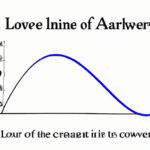
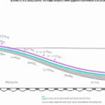
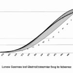
The Lorenz curve is a graphical representation of income distribution within a given population. It plots the cumulative percentage of total income received by the population against the cumulative percentage of the population. This curve is widely used in economics and social sciences to measure inequality. The closer the Lorenz curve is to the line of absolute equality, the more equal the income distribution. On the other hand, a more bowed-out curve suggests greater income inequality. By analyzing the shape and position of the Lorenz curve, policymakers and researchers can better understand the level of inequality present in a society, aiding in the formulation of effective policies to address it.
(What is Lorenz Curve & Gini Coefficient)
The Lorenz curve is a graphical representation that illustrates the distribution of a specified economic variable among a population. Developed by American economist Max O. Lorenz in 1905, this curve is commonly used in the field of economics to measure income inequality or wealth distribution within a society. In its simplest form, the Lorenz curve starts with a straight line that represents perfect equality, wherein every individual in the population has an equal share of the economic variable being analyzed. As the curve progresses, it depicts the cumulative percentage of the variable’s total value held by the corresponding cumulative percentage of the population. Specifically, the x-axis of the curve represents the cumulative percentage of the population ranked in ascending order by income or wealth, while the y-axis displays the cumulative percentage of the total income or wealth of the population being analyzed. The shape of the Lorenz curve identifies the level of income inequality or wealth concentration within a society. If the curve lies below the line of perfect equality, it signifies a higher level of inequality, indicating that a smaller percentage of the population holds the majority of the economic variable being considered. On the other hand, if the curve lies closer to the line of perfect equality, it suggests a more equal distribution of the variable among the population. By analyzing the Lorenz curve, economists can calculate a numerical measure called the Gini coefficient, which quantifies income or wealth inequality. The Gini coefficient ranges from 0 to 1, with 0 representing perfect equality and 1 indicating extreme inequality. In summary, the Lorenz curve provides a visual representation of the distribution of income or wealth within a population and is a valuable tool for understanding and analyzing the level of inequality in a society.Construction of Lorenz curve
The construction of a Lorenz curve involves a specific graphical representation used to illustrate income inequality within a given population. It provides insights into the distribution of income among individuals or households. To construct a Lorenz curve, individuals or households within the population are ranked from lowest to highest based on their income levels. The cumulative percentage of total income earned by these individuals or households is then calculated. The horizontal axis of the Lorenz curve represents the cumulative percentage of households or individuals, while the vertical axis represents the cumulative percentage of total income earned. The values on both axes range from 0% to 100%. Starting from the origin, with 0% of households or individuals and 0% of total income, the Lorenz curve gradually rises toward the diagonal line that represents perfect equality. The diagonal line represents a situation where the cumulative percentage of households or individuals is equal to the cumulative percentage of income. However, in reality, the Lorenz curve deviates from the diagonal line, showcasing income inequality. The curve can vary in shape depending on the distribution of income within the population. For example, if the Lorenz curve lies below the diagonal line, it suggests that a smaller percentage of households or individuals hold a higher percentage of total income. This indicates a higher degree of income inequality within the population. Conversely, if the curve lies above the diagonal line, it suggests a more equal distribution of income. The construction of a Lorenz curve requires data on individual or household incomes. These data are typically obtained through surveys, censuses, or other forms of data collection methods. Once the data is collected and ranked, the cumulative percentages of households or individuals and total income earned are calculated. Lorenz curves are often used in conjunction with another graphical representation called the Gini coefficient. The Gini coefficient is a summary measure of income inequality calculated using the Lorenz curve. It ranges from 0 to 1, with 0 representing perfect equality and 1 representing perfect inequality. In conclusion, the construction of a Lorenz curve involves ranking individuals or households by income levels and calculating the cumulative percentages of households or individuals and total income earned. The resulting curve provides a visual representation of income inequality within a given population.
Interpretation of Lorenz curve
The Lorenz curve is a graphical representation used to analyze income distribution within a particular population. It provides valuable insights into the extent of inequality present within a society. The interpretation of the Lorenz curve is crucial for understanding economic disparities and devising appropriate policies to address them. When interpreting a Lorenz curve, the first thing to note is its shape and curvature. The curve is typically concave, with the line of perfect equality running diagonally from the origin. The further the Lorenz curve is from this line, the greater the level of income inequality within the population under consideration. The area between the Lorenz curve and the line of perfect equality represents the extent of income inequality. A larger area implies a higher degree of inequality, while a smaller area indicates a more equal distribution of income. This area is often calculated and represented by the Gini coefficient, a numerical measure of inequality derived from the Lorenz curve. Another aspect of interpreting the Lorenz curve is identifying key points on the curve. The point where the Lorenz curve originates (0,0) represents the lowest portion of the population, which typically holds no income or wealth. As the curve progresses, it reaches a point where half of the population is encompassed. At this point, the Lorenz curve intersects the line of perfect equality, indicating that the income share is equally distributed among 50% of the population. Beyond this point, the Lorenz curve gradually moves away from the line of perfect equality, indicating an increasing concentration of income among a smaller portion of the population. The further the curve deviates from the line of perfect equality, the greater the income disparity within society becomes. The interpretation of the Lorenz curve can also be used to compare income distribution between different populations or over time. By comparing curves, one can identify whether income inequality is increasing or decreasing, and whether certain policies or interventions have had an impact on income distribution. The Lorenz curve also helps policy-makers and economists design strategies to address income inequality. It highlights the areas and groups of society that are most affected by unequal income distribution, enabling targeted interventions and redistributive measures. For instance, if the Lorenz curve shows high inequality, policymakers may consider implementing progressive taxation, expanding social welfare programs, or investing in education and skill-building initiatives to reduce disparities. In conclusion, the interpretation of the Lorenz curve is essential in understanding income distribution and inequality within a population. It provides valuable insights into the extent of inequality and helps policymakers develop appropriate strategies to address these disparities. By analyzing the shape, curvature, and key points on the curve, one can assess the level of income inequality and make informed decisions to promote more equitable economic outcomes.
Limitations of Lorenz curve
The Lorenz curve is a graphical representation of income inequality within a population. While it is a useful tool for understanding and analyzing income distribution, it is important to acknowledge its limitations. Here are some key limitations of the Lorenz curve: 1. Lack of Precision: The Lorenz curve provides a general overview of income inequality but does not provide precise measurements. It is based on the assumption that individuals are arranged in ascending order of income, which may not always reflect the complex dynamics of real-life economic scenarios. 2. Oversimplification: The Lorenz curve reduces the complexity of income distribution to a single line, neglecting other factors that contribute to inequality, such as education, race, and gender. It fails to account for non-monetary indicators of well-being, such as access to education, healthcare, and social mobility. 3. Two Dimensional and Static Representation: The Lorenz curve represents income inequality based on a two-dimensional graph, which may not capture the full complexity of multidimensional poverty. It fails to capture changes in inequality over time and does not consider the dynamics of wealth accumulation and distribution. 4. Insensitivity to the Shape of the Curve: The Lorenz curve only measures the area between the curve and the line of perfect equality. It does not reflect the shape of the curve, which may vary significantly depending on the population under consideration. Different populations with the same inequality index may have very different Lorenz curves. 5. Focus on Relative Inequality: The Lorenz curve focuses on relative income inequality rather than absolute poverty. While it provides insights into how income is distributed within a society, it does not provide information about the absolute well-being of individuals or the overall level of poverty. 6. Lack of Causal Explanation: The Lorenz curve does not explain the underlying causes of income inequality. It does not account for the complex interplay of factors such as government policies, market forces, cultural norms, and historical factors that contribute to the observed income distribution. 7. Sampling Bias: The accuracy of the Lorenz curve relies on the representativeness of the sample population. If the sample is not representative of the entire population, the resulting Lorenz curve may not accurately reflect income inequality. 8. National vs. Regional Context: The Lorenz curve can vary significantly depending on whether it is applied at the national or regional level. It may not capture the nuances of income inequality within smaller geographic areas, where disparities can be magnified or diminished. It is crucial to consider these limitations when interpreting the Lorenz curve. While it provides a useful visual representation of income inequality, it is important to complement it with other measures and indicators to gain a comprehensive understanding of the complex dynamics of inequality within a society.
Meaning of Lorenz curve
The Lorenz curve is a graphical representation of income distribution within a population. It was developed by the American economist Max O. Lorenz in 1905 as a tool to understand income inequality. The main purpose of the Lorenz curve is to illustrate the deviation of income distribution from perfect equality. It provides a visual representation of how wealth is distributed among individuals in a society. The curve is based on the cumulative proportion of total income received by the corresponding cumulative proportion of the population. To construct a Lorenz curve, individuals in the population are ranked in ascending order based on their income levels. Then, the cumulative proportion of the population is plotted on the x-axis, ranging from 0% to 100%. The cumulative proportion of total income received is plotted on the y-axis, also ranging from 0% to 100%. The resulting curve depicts the relationship between income inequality and the cumulative distribution of income. A perfectly equal distribution of income would be represented by a straight line at a 45-degree angle, known as the line of perfect equality. This means that each portion of the population would hold an equal proportion of the total income. In reality, however, the Lorenz curve almost always deviates from this line, illustrating income inequality. The shape of the Lorenz curve reveals important information about the degree of income inequality within a society. The more the curve is concave from the line of perfect equality, the greater the income inequality. Conversely, if the curve is convex toward the line of perfect equality, it indicates a more equal distribution of income. In addition to its visual representation, the Lorenz curve can also provide a numerical measure of income inequality called the Gini coefficient. The Gini coefficient is calculated by dividing the area between the Lorenz curve and the line of perfect equality by the total area under the line of perfect equality. The resulting value ranges from 0 to 1, where 0 represents perfect equality and 1 represents maximum inequality. The Lorenz curve has become an essential tool for economists, policymakers, and researchers to understand and analyze income inequality. By visually representing the distribution of income, it helps identify patterns, trends, and disparities within societies. This information is vital for designing and implementing policies that aim to reduce inequality and promote social welfare.
Purpose of Lorenz curve
The purpose of the Lorenz curve is to provide a graphical representation of income or wealth inequality within a population. It allows economists and policymakers to assess and analyze the distribution of income or wealth in a society, which is a vital aspect of social and economic development. The Lorenz curve was developed by Max O. Lorenz, an American economist, in 1905. It has since become a widely used tool in economics, particularly in the field of inequality studies. The curve is constructed by plotting the cumulative percentage of total income or wealth against the cumulative percentage of the population. The resulting curve shows the concentration of income or wealth in different parts of the population. By examining the shape of the Lorenz curve, analysts can gain insights into the level and nature of inequality. The closer the Lorenz curve is to the diagonal line of perfect equality, the more equal the distribution of income or wealth. On the other hand, a steep curve indicates high levels of inequality, with a small percentage of the population holding a significant proportion of the total income or wealth. One of the key purposes of the Lorenz curve is to aid in the measurement and comparison of income or wealth inequality. It provides a clear visual representation of the distribution, allowing researchers to observe trends and patterns over time or across different populations. This information is crucial for policymakers in identifying areas of concern and implementing targeted interventions to reduce inequality and promote social welfare. The Lorenz curve also serves as a basis for calculating various inequality indices, such as the Gini coefficient. The Gini coefficient measures the extent of inequality by comparing the area between the Lorenz curve and the diagonal line of perfect equality to the total area under the diagonal line. A higher Gini coefficient indicates higher levels of inequality. Moreover, the Lorenz curve enables policymakers to evaluate the impact of different policies and interventions on inequality. By comparing the shape of the Lorenz curve before and after a policy implementation, analysts can assess whether the policy has resulted in a more equitable distribution of income or wealth. In conclusion, the Lorenz curve plays a crucial role in analyzing and understanding the distribution of income or wealth within a population. Its primary purpose is to provide a graphical representation of inequality, aiding in the measurement, comparison, and evaluation of policy interventions. By utilizing the Lorenz curve, economists and policymakers can work towards creating a more equitable and sustainable society.
