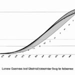
The Lorenz curve serves to depict income inequality within a given population. It shows how wealth is distributed among individuals, indicating the concentration or dispersion of income. By plotting the cumulative percentage of total income against the cumulative percentage of population, the curve provides a graphical representation of income inequality. A perfectly equal distribution would result in a straight line, while a curved line signifies inequality. The steeper the curve, the greater the inequality. This tool is used by economists, policymakers, and social scientists to study income disparities and evaluate the effectiveness of various economic policies aimed at reducing inequality. It helps in understanding and addressing social and economic issues in a society.
Table of Contents
- Calculation of the Lorenz curve
- Criticisms of the Lorenz curve
- Definition of the Lorenz curve
- Interpretation of the Lorenz curve
- Uses of the Lorenz curve
(Lorenz Curve and Gini Coefficient – Measures of Income Inequality)
The Lorenz curve is a visual representation of the distribution of income or wealth within a population. It was developed by American economist Max O. Lorenz in 1905 as a tool to measure income inequality. The purpose of the Lorenz curve is to provide a graphical depiction of how the income or wealth is distributed among the individuals or households in a given society.
The curve is derived from a cumulative distribution function that represents the percentage of the total income or wealth that is earned or owned by a certain percentage of the population. The Lorenz curve starts at the bottom-left corner of the graph, representing the situation where the entire income or wealth is owned or earned by the bottom percentage, and then gradually curves upwards towards the top-right corner, signifying a more equal distribution.
The closer the Lorenz curve is to the diagonal line (known as the line of perfect equality), the more equal the distribution of income or wealth in the society. On the other hand, if the curve deviates significantly from the diagonal, it indicates a high level of income or wealth inequality.
By analyzing the shape of the Lorenz curve, policymakers and researchers can gain valuable insights into the level of income or wealth disparities in a society. This information can then be used to develop strategies and policies aimed at reducing inequality and promoting social and economic well-being for all members of the society.
In summary, the purpose of the Lorenz curve is to visually represent the distribution of income or wealth in a society, providing a snapshot of the level of inequality and serving as a tool for policymakers and researchers to develop targeted interventions for a more equitable society.
Calculation of the Lorenz curve
The Lorenz curve is an essential tool for understanding income distribution within a population. It depicts the relationship between the cumulative percentage of the population and the cumulative share of total income or wealth. By calculating the Lorenz curve, we can measure the level of inequality in a society.
To calculate the Lorenz curve, it is necessary to have data on the income or wealth distribution of a population. This data is typically represented in the form of a frequency distribution table or a cumulative frequency distribution. With this information, we can determine the cumulative percentage of the population and the cumulative share of total income or wealth at each point.
The first step in calculating the Lorenz curve is to arrange the data in increasing order of income or wealth. Next, we calculate the cumulative percentage of the population and the cumulative share of total income or wealth for each interval. This involves summing up the frequencies or cumulative frequencies up to the current interval.
Once we have the cumulative percentages of the population and the cumulative shares of total income or wealth for each interval, we can plot these points on a graph. The x-axis represents the cumulative percentage of the population, ranging from 0% to 100%, and the y-axis represents the cumulative share of total income or wealth, also ranging from 0% to 100%.
By connecting the plotted points on the graph, we obtain the Lorenz curve. This curve visually illustrates the degree of income or wealth inequality within a population. A perfect equality scenario would result in a diagonal line, while a more unequal distribution would show a greater concavity towards the top-left corner of the graph.
The area between the Lorenz curve and the diagonal line of perfect equality represents the extent of income or wealth inequality. This area is known as the Gini coefficient, which is a numerical measure of inequality. The Gini coefficient ranges from 0 to 1, where 0 represents perfect equality and 1 represents complete inequality.
In conclusion, the calculation of the Lorenz curve is a crucial step in understanding income distribution and inequality. By plotting the cumulative percentages of the population and the cumulative shares of total income or wealth, we can visually depict and quantify the level of inequality within a society. This information is essential for policymakers and researchers seeking to address and mitigate income disparities.
Criticisms of the Lorenz curve
The Lorenz curve is a graphical representation used to illustrate income inequality within a population. While this tool has been widely used for its simplicity and effectiveness, it also faces criticism.
One major criticism of the Lorenz curve is that it only focuses on income distribution and fails to capture other important factors such as wealth distribution, access to healthcare, education, and employment opportunities. Critics argue that a more comprehensive measurement should be used to assess overall inequality, as income alone does not provide a complete picture of a population’s well-being.
Another criticism is that the Lorenz curve assumes a linear relationship between income and welfare, disregarding non-monetary factors that contribute to individuals’ quality of life. For example, someone may have a low income but benefit from strong community support, good health, and a safe living environment, leading to a higher overall well-being compared to someone with a higher income but lacking these supportive factors.
Additionally, critics argue that the Lorenz curve does not take into account regional disparities in income distribution. In many countries, disparities between rural and urban areas can be significant. Focusing solely on national income distribution may hide these regional imbalances, thereby providing an incomplete understanding of overall inequality.
Another criticism is that the Lorenz curve assumes a closed economy, neglecting the effects of international trade and globalization. With the increasing interconnectedness of economies, income inequality within a country may be influenced by global factors that the Lorenz curve fails to capture. This can result in an inaccurate depiction of the true distribution of wealth within a population.
Furthermore, the Lorenz curve does not consider the impact of social and institutional factors on income disparity. Factors such as discrimination, corruption, and lack of equal opportunities can contribute significantly to income inequality but are not captured by the curve. Therefore, critics argue that a more comprehensive approach is needed to understand the complexities of inequality within societies.
In conclusion, while the Lorenz curve has its merits, it also faces valid criticisms. Its focus on income distribution and limited scope make it an incomplete tool for assessing overall inequality. To gain a more comprehensive understanding, it is essential to consider other factors, such as wealth distribution, access to healthcare and education, regional disparities, and the impact of social and institutional factors on income inequality. By incorporating these elements, policymakers can make informed decisions to address the root causes of inequality within societies.
Definition of the Lorenz curve
The Lorenz curve is a graphical representation of income distribution that helps analysts understand wealth disparities within a population. It was developed by economist Max O. Lorenz in 1905 and has since become a widely used tool in the field of economics.
The curve is formed by plotting cumulative percentages of income or wealth on the y-axis and cumulative percentages of households or individuals on the x-axis. The diagonal line, known as the line of perfect equality, represents a hypothetical situation where income is distributed equally among all members of a society.
In reality, however, income distribution is often highly unequal, and the Lorenz curve displays this inequality graphically. The further the curve lies below the line of perfect equality, the greater the level of inequality in a society.
To interpret the Lorenz curve, one can look at the distance between the curve and the line of perfect equality. This distance represents the extent of income inequality within a population. A larger area between the curve and the line indicates higher levels of inequality.
Another useful tool derived from the Lorenz curve is the Gini coefficient, which provides a single measure of income inequality. The Gini coefficient is the ratio of the area between the Lorenz curve and the line of perfect equality to the total area under the line of perfect equality. It ranges from 0 to 1, with 0 representing perfect equality and 1 representing maximum inequality.
The Lorenz curve and the Gini coefficient allow policymakers, economists, and social scientists to assess the effectiveness of various economic policies, such as taxation and social welfare programs, in reducing income inequality. By providing a visual representation of wealth disparities, the Lorenz curve highlights the need for equitable economic policies to ensure a fair distribution of resources and opportunities.
In conclusion, the Lorenz curve is a powerful tool for understanding income distribution and inequality within a society. Its graphical representation allows for easy interpretation and comparison across different populations. By highlighting the extent of inequality, the Lorenz curve contributes to informed discussions and decision-making aimed at promoting fairness and social justice.
Interpretation of the Lorenz curve
Interpretation of the Lorenz curve can provide valuable insights into income distribution within a population. This curve, derived from the work of American economist Max O. Lorenz, depicts the cumulative share of income held by different groups of individuals.
When interpreting the Lorenz curve, it is essential to understand its shape and characteristics. The curve is usually concave, showing that income distribution is disproportionately skewed towards wealthier individuals. The greater the concavity, the more pronounced the income inequality.
The Lorenz curve also helps in measuring income inequality through the Gini coefficient. This coefficient is derived by dividing the area between the Lorenz curve and the line of perfect equality by the total area under the line of perfect equality. A higher Gini coefficient indicates greater income inequality.
This interpretation is crucial for policymakers as it allows them to assess the effectiveness of social and economic policies aimed at reducing income inequality. By comparing different Lorenz curves over time or across different countries, policymakers can determine the impact of various policies on income distribution.
For example, if a country’s Lorenz curve shows a significant shift towards income equality over time, it may indicate successful poverty alleviation programs or inclusive economic policies. On the other hand, a stagnant or worsening curve suggests a need for targeted interventions to address income disparities.
The Lorenz curve also helps researchers and economists analyze the impact of various factors on income distribution. It enables the identification of groups or regions that are more vulnerable to income disparities, allowing for targeted interventions.
Moreover, the Lorenz curve can reveal the degree of income concentration within different percentile groups. By examining the curve’s steepness at different points, analysts can determine whether income is concentrated in a few elite individuals or distributed more evenly.
In conclusion, the interpretation of the Lorenz curve is crucial for understanding income inequality and assessing the impact of policies aimed at reducing disparities. Its concavity, Gini coefficient, and changes over time provide valuable insights into income distribution patterns. With a clear understanding of the Lorenz curve, policymakers can make informed decisions to promote more equitable and inclusive societies.
Uses of the Lorenz curve
The Lorenz curve, a graphical representation of income distribution, has various applications. This curve is essential in understanding economic inequality and conducting policy analysis. One significant use is in measuring income inequality within a specific population. By plotting the cumulative share of income against the cumulative share of the population, the shape of the Lorenz curve can indicate the level of income disparity. Policymakers can use this information to design targeted interventions to address poverty and inequality.
Another important application of the Lorenz curve is in comparing income distributions over time or across different countries. By comparing multiple curves, economists can assess changes in income inequality and make cross-country comparisons. This helps in identifying the factors that contribute to variations in income distribution, such as economic policies, social programs, and cultural factors.
The Lorenz curve also plays a key role in estimating poverty levels within a population. By analyzing the area between the Lorenz curve and the line of perfect equality, economists can calculate the Gini coefficient, a commonly used measure of income inequality. This coefficient helps policymakers assess poverty rates and design poverty alleviation strategies.
Furthermore, the Lorenz curve is instrumental in evaluating the effectiveness of government policies aimed at reducing income inequality. By analyzing changes in the shape of the curve over time, policymakers can determine whether these policies have had the desired impact. This helps in guiding future policy decisions and shaping more equitable economic systems.
Finally, the Lorenz curve provides valuable insights into social welfare. By examining the area under the Lorenz curve, economists can measure social welfare and assess the overall well-being of a population. This information is crucial for policymakers in making informed decisions related to resource allocation, social programs, and poverty reduction.
In conclusion, the Lorenz curve is a powerful tool for analyzing income inequality and understanding its implications for society. Its uses range from measuring income distribution within a population to comparing distributions across countries and evaluating the effectiveness of government policies. By providing valuable insights into poverty, inequality, and social welfare, the Lorenz curve helps policymakers design strategies for addressing economic disparities and promoting inclusive growth.


