A Lorenz curve measures income inequality by plotting the cumulative share of income against the cumulative share of the population. It visually represents the distribution of wealth within a society. The curve starts at the bottom left, where the poorest individuals hold the smallest portion of income. As it moves upward and to the right, it shows how wealth becomes increasingly concentrated among the wealthiest members of the population. The more bowed the curve, the greater the income inequality. Policymakers and economists use the Lorenz curve to assess and address disparities in income distribution for a more equitable society.
Table of Contents
- Application of Lorenz curve.
- Construction of Lorenz curve
- Definition of Lorenz curve
- Interpretation of Lorenz curve
- Purpose of Lorenz curve
(Lorenz Curve and Gini Coefficient – Measures of Income Inequality)
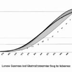
A Lorenz curve is a graphical representation of income distribution. It shows how wealth or income is spread among the population. The curve is named after American economist Max O. Lorenz, who developed it in 1905. On the graph, the x-axis represents the cumulative percentage of households or individuals, while the y-axis represents the cumulative percentage of total income or wealth they possess.
A perfect egalitarian society would have a diagonal line, indicating equal distribution. However, in reality, most societies have curves bending below this line, showing inequality. The greater the distance between the Lorenz curve and the diagonal line, the higher the inequality.
One can calculate the Gini coefficient from a Lorenz curve. This numerical measure ranges from 0 to 1, with 0 representing perfect equality and 1 representing maximum inequality.
By visually representing disparities, the Lorenz curve helps policymakers in designing social programs to mitigate inequality. Understanding this concept is crucial for economists, policymakers, and anyone concerned with social justice and equitable wealth distribution.
Application of Lorenz curve.
The application of the Lorenz curve provides a powerful way to visually represent income or wealth distribution within a population. Imagine you’re at the edge of a serene lake, tossing pebbles into its still waters. Each ripple represents an individual’s level of income, spreading across society in varying degrees. The Lorenz curve allows us to grasp these disparities with clarity, like reading stories written on the water.
When economists use the Lorenz curve, they often aim to evaluate inequality within a particular region or country. By plotting cumulative income or wealth against cumulative households from lowest to highest earners on a graph, patterns emerge that speak volumes about social dynamics and economic disparities.
As you observe this elegant curve take shape on paper, your heart may ache with empathy for those struggling at the lower end – their ripples barely making a dent compared to the splashes created by the wealthy elite. It’s more than just lines and points; it’s about real people facing real challenges every day.
Governments and policymakers rely heavily on Lorenz curves when crafting strategies to address income inequality. The data derived from these curves guides decisions related to taxation policies, social welfare programs, and initiatives aimed at bridging gaps between different socio-economic groups.
Picture standing in a bustling city square surrounded by faces reflecting diverse financial situations. Some are beaming with prosperity while others bear expressions etched with worry over looming bills and uncertain futures. The Lorenz curve captures this mosaic of experiences in one comprehensive visual narrative.
In classrooms around the world, educators utilize Lorenz curves as teaching tools to foster critical thinking among students studying economics or sociology.
By examining how resources are distributed among various segments of society through this unique lens‚students can develop empathy for those less fortunate while gaining insights into complex societal structures.
So next time you encounter a Lorenz curve plotted neatly on paper ‚allow yourself to see beyond mere lines and numbers. Feel the stories resonating within each bend and slope‚a poignant reminder that behind statistics lie human lives intertwined in intricate webs of privilege‚struggle‚and hope
Construction of Lorenz curve
When delving into the construction of a Lorenz curve, one embarks on a journey that unveils not just mathematical intricacies but also the essence of societal disparities. Picture this—Lorenz curves are like intricate spiderwebs spun across graphs, capturing the tangled reality of income distribution within a population.
To plot this curve, one must first gather data on individual incomes in a specific region or country. These incomes are then ranked from lowest to highest—an act akin to peering through a window into people’s financial worlds. The cumulative percentage of total income is calculated for each corresponding percentile of households—a process that breathes life into statistical figures and transforms them into poignant narratives.
As these calculations unfold, emotions may stir within us. We become acutely aware of the stark divide between the haves and have-nots—the uneven terrain where wealth cascades unequally among individuals. Each plotted point on the Lorenz curve reflects this profound truth with unwavering honesty.
Imagine gazing at the plotted points meandering across the graph—not mere dots but echoes of real lives lived in economic landscapes both lush and barren. The line connecting these points weaves tales of privilege and hardship, painting a vivid portrait of economic injustice etched onto society’s canvas.
With each stroke of calculation, we witness how wealth concentrates in certain pockets while elusively slipping away from others—a dance as old as civilization itself. The Lorenz curve stands as an impartial observer bearing witness to humanity’s struggle for equitable distribution amidst swirling currents of prosperity and poverty.
And so, when we delve deeper into constructing a Lorenz curve, it is not just about numbers—it is about confronting uncomfortable truths that lie beneath our societal structures. It challenges us to question prevailing norms and advocate for fairness in resource allocation—to strive towards a world where every point on that curve shines bright with equal opportunity and shared prosperity.
Definition of Lorenz curve
When you hear about the Lorenz curve, what comes to mind? Well, let’s dive into its definition together. Imagine a graph that looks like a squiggly line dancing across from the bottom left corner of your paper to the top right. This curvy fellow represents something profound – it showcases income distribution in an area or country.
Now, hold on for a second and let me explain how this works. Picture yourself at one end of this line; maybe you’re scraping by with just enough cash for bills and food each month – that would be the beginning point. At the other end stands someone with pockets full of gold coins and luxury cars lining their driveway – that’s the endpoint.
As we map out everyone’s income on this rollercoaster ride of wealth distribution, patterns begin to emerge – revealing who holds most of the money and who barely has any spare change after rent is paid.
The closer our Lorenz curve mimics a straight diagonal line from corner to corner, the fairer incomes are distributed among folks in our hypothetical society. But if this wavy dancer veers far away from equality towards one side or curves sharply upwards steeply—well then buckle up because inequality is alive and well within those lines!
This curve doesn’t just show us numbers; it tells stories too—the tale where dreams flourish alongside struggles masked by statistics churned out each year.
Imagine staring at this graphical representation feeling your heart tug as it sinks knowing some thrive while others barely survive day-to-day challenges thrown their way—all depicted through these twists and turns etched onto paper before you.
So next time you catch sight of a Lorenz curve waltzing across economic reports or social studies textbooks remember—it’s not just lines on paper but reflections mirroring realities faced by everyday people trying their best against odds stacked high above them.
(Gini Coefficient and Lorenz Curve)
Interpretation of Lorenz curve
When you delve into the intricate world of economics, one fascinating tool that emerges is the Lorenz curve. This curve isn’t just a line on a graph; it’s a visual representation of income distribution within a specific population. Imagine standing at the crossroads of wealth and poverty, with every point on this curve telling a unique story.
As you trace the gentle arc of the Lorenz curve, each bend reveals how income is divided among individuals or households in a society. The way it hugs closer to one axis depicts inequality — where some hold vast riches while others merely scrape by. It’s like peering through a window into the soul of societal fairness or its absence.
The lore behind the Lorenz curve lies in its ability to show us disparities starkly etched across economic landscapes. A bulging section signifies concentrated affluence, painting images of opulence and luxury reserved for few hands. Meanwhile, meandering segments whisper tales of struggle and deprivation endured by those left clutching crumbs from life’s table.
Yet, amid these harsh truths laid bare by the curve’s undulating path, there exists hope and possibility for change. By scrutinizing each inflection point carefully, economists seek pathways towards greater equity and justice within our communities. They aim not merely to observe but to act — reshaping destinies veiled behind percentages and decimals.
This journey alongside the Lorenz curve evokes emotions as diverse as human experiences themselves: empathy for those marginalized beyond measure; determination to bridge gaps that yawn wide open; optimism that tomorrow may dawn brighter than today ever dared promise.
So next time you gaze upon that humble graph bearing an elegant name — remember it carries more weight than lines and numbers alone can convey. It tells stories woven from joys uncelebrated, tears unseen, dreams deferred…and beckons us all to be agents of change in weaving new narratives where every life finds meaning and worth along their own unique arc on this complex canvas called society.
Purpose of Lorenz curve
When we delve into the realm of economic inequality, one powerful tool that comes to our aid is the Lorenz curve. Picture it as a visual storyteller, graphing the distribution of wealth or income within a society. This elegant curve doesn’t just present numbers; it unravels stories of disparity and sheds light on social justice.
Imagine standing at the edge of an imaginary world divided by riches and scarcity, with each point on the Lorenz curve whispering tales from different corners. As you trace its graceful arc, you realize that this curve reveals not just percentages but lives intertwined in economic fates.
The purpose of the Lorenz curve transcends mere data representation. It’s about capturing reality—the reality where some thrive amidst abundance while others grapple with want. The curve doesn’t sugarcoat truths but lays them bare for all to see.
Let’s bring emotions into play here: imagine feeling a pang in your chest as you observe how unequally resources are shared among fellow beings—an ache for those struggling against towering odds, juxtaposed with admiration for those basking in opulence.
Every bend and dip in the Lorenz curve paints a vivid picture—a portrait laced with hope, struggle, privilege, and perseverance—all interwoven like threads in life’s intricate tapestry. It challenges us to ponder: What does fairness mean? How can we bridge these chasms of inequality?
The beauty of the Lorenz curve lies not only in its mathematical precision but also in its capacity to evoke empathy—to make us feel connected to those whose paths diverge so starkly from our own. It beckons us to contemplate solutions beyond statistics—solutions rooted in compassion and solidarity.
So next time you gaze upon a Lorenz curve, let yourself be moved by more than just lines on paper. Allow it to kindle empathy within you and spark a fire for change—for a world where every individual has an equal chance at prosperity and well-being.
As we navigate through complexities painted by this humble yet profound curve, may we find inspiration to strive towards a future where economic equity is not just an ideal but a lived reality—a future where every point on the chart converges towards unity and shared prosperity.


