Explanation of Lorenz curve
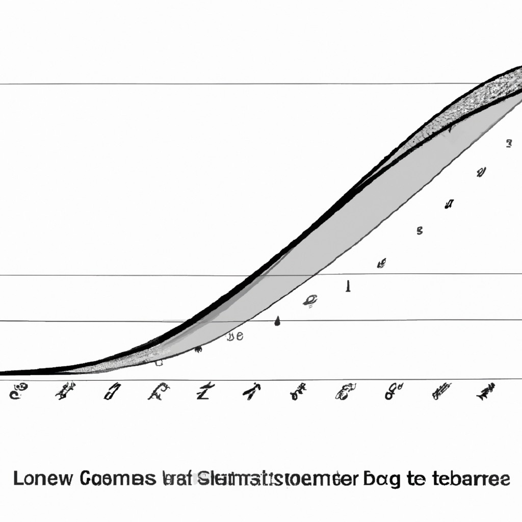
The Lorenz curve illustrates income inequality by comparing the cumulative share of income received by the population. A perfectly equal income distribution would form a straight line from the bottom left corner to the top right corner. In reality, the curve typically bends downwards, indicating inequality. The further away the curve is from the line of perfect equality, the greater the income disparity. Understanding the Lorenz curve helps policymakers address inequities and design effective redistribution policies. It encourages reflection on societal values and the distribution of resources, sparking conversations on fairness and social justice.
Read more
Difference between Lorenz curve and Gini coefficient

The Lorenz curve displays income distribution graphically, indicating inequality. The Gini coefficient is a numerical measure calculated from the Lorenz curve, quantifying inequality. The Lorenz curve visually represents income distribution within a population. The Gini coefficient is a numerical value that summarizes the inequality observed in the Lorenz curve. A more equal distribution of income corresponds to a Lorenz curve closer to the line of perfect equality. The Gini coefficient ranges from 0 (perfect equality) to 1 (perfect inequality). The higher the Gini coefficient, the greater the level of income inequality in a society. The two concepts provide complementary insights into income inequality.
Read more
Criticisms of the Lorenz curve methodology
Criticisms of the Lorenz curve methodology arise due to its reliance on assumptions and simplifications in measuring income inequality. Detractors argue that it overlooks inequalities within income groups, providing an incomplete picture. Critics also contend that it fails to account for non-monetary forms of wealth and disparities in essential resources. Additionally, the Lorenz curve does not consider factors such as social mobility and structural barriers that perpetuate income inequality. Some scholars suggest that alternative approaches, like the Gini coefficient, offer a more comprehensive analysis of income distribution. Despite its limitations, the Lorenz curve methodology remains a valuable tool for understanding economic disparities.
Read more
Controversies surrounding data interpretation with Lorenz curve
Lorenz curve analysis sparks debates in statistical circles due to its complex interpretation. Concerns arise over misrepresentations. It unveils discrepancies in wealth distribution, igniting debates among policymakers. Proponents argue it highlights disparities accurately. Critics accuse it of oversimplification, leading to misjudgments. Despite its flaws, the Lorenz curve remains a valuable tool. The curve unveils societal imbalances, urging action towards equality. Its visual impact stirs emotions, spurring change initiatives. Proper understanding of Lorenz curve intricacies ensures informed decisions. Robust data scrutiny is crucial in preventing misinterpretation and guiding meaningful strategies. Clarity in interpretation is essential for impactful policy formulation.
Read more
Types of assumptions in Lorenz curve
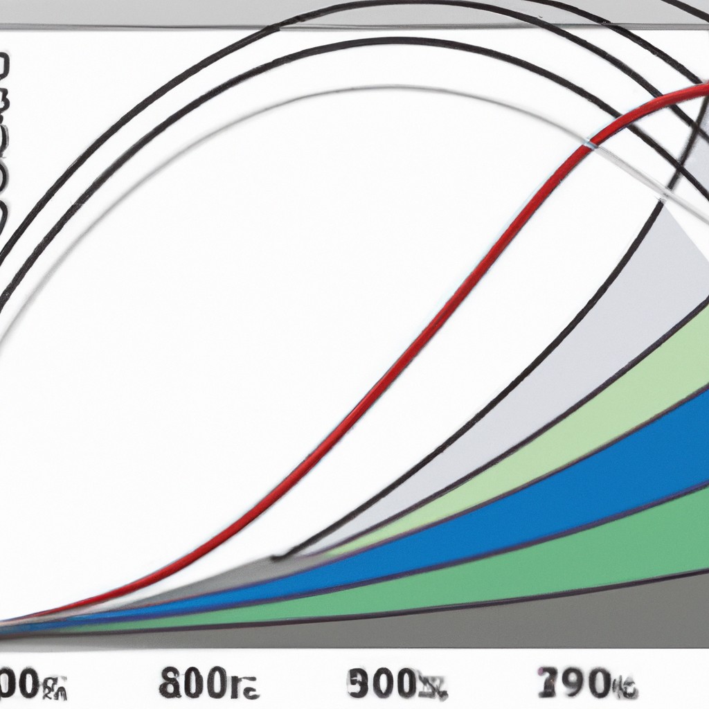
When analyzing the Lorenz curve, it is important to consider various assumptions. One key assumption is the linearity between income percentile and cumulative income proportion. Another assumption involves the inequality measure used to calculate the Gini coefficient. Additionally, it is assumed that income distribution is stable over time for accurate comparisons. Finally, there is the assumption of income data accuracy and representativeness to ensure reliable results. These assumptions guide the interpretation of the Lorenz curve and provide a framework for understanding income inequality dynamics. Understanding these assumptions is crucial for meaningful analysis and policy formulation related to income distribution.
Read more
Definition of Lorenz curve Calculation and interpretation of Gini coefficient Use of Lorenz curve in measuring income inequality Limitations and criticisms of Lorenz curve analysis Applications of Lorenz curve analysis in policy-making and economics resea

The Lorenz curve shows income distribution across a population, Gini coefficient quantifies inequality. Analyze income inequality. Limitations include assuming a linear relationship, criticisms point out its simplification. Policy-making and economic research use analyze distribution fairness.
Read more
What is a Lorenz curve

A Lorenz curve measures income inequality by plotting the cumulative share of income against the cumulative share of the population. It visually represents the distribution of wealth within a society. The curve starts at the bottom left, where the poorest individuals hold the smallest portion of income. As it moves upward and to the right, it shows how wealth becomes increasingly concentrated among the wealthiest members of the population. The more bowed the curve, the greater the income inequality. Policymakers and economists use the Lorenz curve to assess and address disparities in income distribution for a more equitable society.
Read more
How to interpret a Lorenz curve

To interpret a Lorenz curve, compare it to the line of perfect equality. A perfect equality line is a diagonal line from the bottom left to the top right. The curve represents income distribution. If the Lorenz curve lies below the perfect equality line, wealth inequality is present. Conversely, if it coincides with the equality line, perfect income equality exists. The further the curve deviates from the equality line, the more pronounced income inequality is. To quantify this inequality, the Gini coefficient is used. A higher Gini coefficient implies greater income inequality within the analyzed population.
Read more
Applications of Lorenz curve in economics
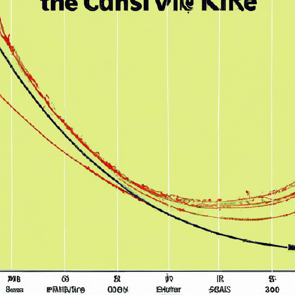
The Lorenz curve helps study income inequality by showing how wealth is distributed among households. Economists use it to analyze disparities in income distribution and measure the effectiveness of economic policies aimed at reducing inequality. By comparing the Lorenz curves of different countries, policymakers can assess the impact of various social and economic programs. This curve provides a visual representation of income inequality, with the diagonal line representing perfect equality. The further the Lorenz curve deviates from this line, the greater the income inequality in a society. Understanding and interpreting the Lorenz curve can guide policymakers in designing more equitable and effective economic policies.
Read more
Limitations and criticisms of using the Lorenz curve to measure income inequality

Critics of the Lorenz curve argue that it oversimplifies income disparities. It may not capture all dimensions of inequality accurately. The curve relies heavily on accurate income data, which can be challenging to obtain. It may not consider factors such as wealth distribution and social mobility adequately. Some suggest combining it with other metrics for a more comprehensive assessment. Despite its limitations, the Lorenz curve remains a valuable tool in analyzing income distribution. It illustrates inequality visually and prompts discussions on societal fairness. While critiques are valid, the curve’s simplicity can still offer insights into economic disparities and equity.
Read more


