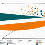
The Lorenz curve is a graphical representation of income distribution within a population. It compares the cumulative share of income received by different segments of the population with the cumulative share of the population. By plotting these two variables on a graph, the Lorenz curve visually illustrates the income inequality within a society. A perfectly equal income distribution would result in a diagonal line, whereas a highly unequal distribution would deviate significantly from this line. Understanding the relationship between the Lorenz curve and income distribution is crucial for policymakers as it provides insights into the level of inequality and can inform strategies for addressing income disparities.
(Lorenz Curve and Gini Coefficient – Measures of Income Inequality)
The Lorenz curve is a graphical representation of income distribution within a population. It is used to understand how income is distributed among individuals or households and can provide insights into income inequality. The curve is constructed by plotting the cumulative percentage of total income received against the cumulative percentage of the population. In other words, it shows what percentage of total income is earned by different segments of the population. The relationship between the Lorenz curve and income distribution can be analyzed by comparing it to the line of perfect equality, which represents a perfectly equal income distribution. If the Lorenz curve lies below the line of perfect equality, it indicates income inequality, with the majority of income concentrated in a small portion of the population. Conversely, if the curve is closer to the line of perfect equality, it represents a more equal distribution of income. The Lorenz curve can also be used to calculate a summary measure of income inequality, known as the Gini coefficient. This coefficient is derived from the area between the Lorenz curve and the line of perfect equality, and ranges from 0 (perfect equality) to 1 (perfect inequality). A higher Gini coefficient indicates greater income inequality within a population. Understanding the relationship between the Lorenz curve and income distribution is crucial for policymakers and researchers. It helps in identifying the extent of income inequality present in a society and can guide efforts to address this issue. Additionally, by analyzing changes in the Lorenz curve over time, it is possible to monitor trends and evaluate the impact of policies aimed at reducing income inequality. In conclusion, the Lorenz curve is a useful tool for visualizing and analyzing income distribution within a population. By examining the curve and the Gini coefficient, policymakers and researchers can gain valuable insights into income inequality and work towards creating a fairer and more equitable society.Definition of Lorenz curve
The Lorenz curve is a graphical representation that illustrates the distribution of income or wealth in a society. Developed by Max O. Lorenz in 1905, this curve provides a visual depiction of the level of inequality within a given population. It is widely used in economics and sociology to analyze income distribution patterns and measure income inequality. The Lorenz curve is constructed by plotting cumulative percentages of income or wealth against the cumulative percentage of the population. The horizontal axis represents the cumulative share of the population, starting from the poorest to the richest, while the vertical axis represents the cumulative share of income or wealth. The curve begins at the bottom-left corner, which indicates that the poorest individuals in the population hold no income or wealth. The ideal distribution of income or wealth, where everyone has an equal share, is represented by a straight line at a 45-degree angle from the origin. However, in reality, the distribution is rarely equal, resulting in a different shape for the Lorenz curve. The further the Lorenz curve deviates from the 45-degree line, the greater the level of inequality in the society. By examining the Lorenz curve, several important measures can be derived to quantify income inequality. The most common measure is the Gini coefficient, which is calculated as the ratio of the area between the Lorenz curve and the 45-degree line to the total area under the 45-degree line. The Gini coefficient ranges from 0 to 1, where 0 represents perfect equality, and 1 indicates extreme inequality. The Lorenz curve enables researchers and policymakers to understand the extent of income or wealth disparities within a society. It can be used to compare different countries, regions, or time periods to assess changes in income distribution. Moreover, the Lorenz curve helps in identifying segments of the population that are disproportionately affected by income inequality, allowing policymakers to design targeted interventions to address this issue. In conclusion, the Lorenz curve is a fundamental tool for analyzing income distribution and measuring income inequality within a society. It provides a clear visual representation of the distribution of income or wealth and enables the calculation of important metrics such as the Gini coefficient. Understanding the Lorenz curve can contribute to informed discussions and policies aimed at promoting a more equitable distribution of resources in society.
Explanation of income distribution
Explanation of income distribution refers to the analysis and understanding of how income is distributed within a particular population or society. It provides insights into the economic disparities that exist among individuals or households, and sheds light on the fairness and equality of income allocations. Income distribution is typically represented by a graphical tool called the Lorenz curve. This curve visually depicts the cumulative distribution of income against the cumulative percentage of the population. The curve starts at the bottom left corner, indicating that the lowest income earners make up the lowest percentage of the population, and it ends at the top right corner, representing the highest income earners and their share of the population. The shape of the Lorenz curve provides crucial information about the degree of income inequality within a society. If the curve lies closer to the line of perfect equality, it indicates a more equitable distribution of income, whereas a curve that deviates significantly from the line suggests higher levels of inequality. The concept of income distribution can be explained by using various indicators. One commonly used metric is the Gini coefficient. The Gini coefficient measures income inequality by calculating the area between the Lorenz curve and the line of perfect equality. It ranges from 0 to 1, with 0 representing perfect equality and 1 indicating extreme inequality. A lower Gini coefficient implies a more equal distribution of income, while a higher coefficient implies the opposite. Factors that influence the pattern of income distribution include education, skills, access to resources, job opportunities, and social policies. Countries with higher levels of education and better access to resources tend to exhibit a more balanced income distribution, as individuals have greater opportunities to acquire skills and secure higher-paying jobs. Additionally, well-designed social policies, such as progressive taxation and targeted welfare programs, can also contribute to reducing income inequality. Income distribution has significant implications for social and economic outcomes. High levels of income inequality can hinder economic growth and development, as it limits the purchasing power of the lower-income groups and perpetuates wealth disparities. It can also lead to social unrest, political instability, and a decreased sense of social cohesion. Understanding the dynamics of income distribution is critical for policymakers, economists, and researchers alike. By comprehending the factors that drive income disparities and implementing policies to address them, societies can work towards achieving more equitable income distributions and fostering inclusive economic growth.
Interpreting the Lorenz curve
Interpreting the Lorenz Curve: The Lorenz curve provides a graphical representation of income distribution within a population. It offers valuable insights into the level of inequality and wealth concentration within a given society. Interpreting the Lorenz curve entails understanding its shape, its relationship to the diagonal line of perfect equality, and the measures derived from it. The shape of the Lorenz curve indicates the degree of income inequality. If the curve lies below the diagonal line, it suggests a more equal distribution of income, while a curve above the diagonal suggests greater inequality. The distance between the curve and the diagonal line represents the absolute inequality. A steep curve indicates high levels of inequality, whereas a flatter curve signifies relatively more equitable income distribution. Another aspect to consider when interpreting the Lorenz curve is the area between the curve and the line of perfect equality. This area, known as the Lorenz curve area, is used to calculate inequality measures like the Gini coefficient. The Gini coefficient, ranging from 0 to 1, quantifies income inequality, with 0 representing perfect equality and 1 indicating maximum inequality. A larger area between the Lorenz curve and the line of perfect equality denotes greater income inequality and a higher Gini coefficient. It is important to note that the Lorenz curve provides a relative measure of income distribution rather than an absolute income assessment. This means that the curve illustrates the proportion of total income received by different percentiles of the population rather than the actual monetary value. By analyzing the Lorenz curve, policymakers and researchers can understand how income is distributed within a society and identify areas where income gaps are most significant. Interpreting the Lorenz curve also allows for comparisons between different countries, regions, or time periods. By examining variations in the curve’s shape and the corresponding Gini coefficients, researchers can evaluate changes in income distribution over time. Additionally, comparisons between countries with similar Lorenz curve shapes but different Gini coefficients can provide insights into the effectiveness of policies aimed at reducing income inequality. In conclusion, interpreting the Lorenz curve provides a comprehensive understanding of income distribution and inequality within a population. By analyzing its shape, the area between the curve and the line of perfect equality, and measures such as the Gini coefficient, policymakers and researchers can gain valuable insights into the extent and nature of income disparities. This understanding is crucial for addressing inequalities and formulating effective policies to promote more equitable income distribution.
Measuring income inequality using the Lorenz curve.
Measuring income inequality using the Lorenz curve is a commonly used technique in economics. The Lorenz curve is a graphical representation of the distribution of income in a given population. It provides a way to visualize and quantify the level of income inequality within a society. The Lorenz curve is constructed by plotting the cumulative share of income against the cumulative share of the population. The horizontal axis represents the cumulative share of the population, while the vertical axis represents the cumulative share of income. The line of perfect equality, also known as the line of equity, is represented by a straight line at a 45-degree angle from the origin. This line indicates that income is distributed equally among the population. However, in reality, income distribution follows a more unequal pattern. The Lorenz curve depicts this by bending away from the line of perfect equality. The extent of the curve’s deviation from the line of perfect equality indicates the level of income inequality. The greater the deviation, the higher the level of income inequality within the population. The Gini coefficient is commonly used to measure income inequality using the Lorenz curve. Derived from the Lorenz curve, the Gini coefficient is a numerical value between 0 and 1. A Gini coefficient of 0 represents perfect equality, while a coefficient of 1 represents maximum inequality. The Gini coefficient is calculated by dividing the area between the Lorenz curve and the line of perfect equality by the total area under the line of perfect equality. The value of the Gini coefficient allows for easy comparison of income inequality across different populations and time periods. By comparing Gini coefficients between countries or regions, policymakers and researchers can assess the relative levels of income inequality and make informed decisions to address any disparities. The use of the Lorenz curve and the Gini coefficient in measuring income inequality has several advantages. Firstly, it provides a clear and intuitive graphical representation of income distribution. This helps policymakers and the public to understand and visualize the level of income inequality within a society. Secondly, the Gini coefficient provides a single value that summarizes the level of income inequality, making it easy to compare and track changes over time. In conclusion, measuring income inequality using the Lorenz curve and the Gini coefficient is a valuable tool in economics. It allows us to quantify and compare the level of income inequality within different populations. By understanding and analyzing income distribution, policymakers can work towards addressing inequalities and promoting a more equitable society.
Method of constructing a Lorenz curve
The method of constructing a Lorenz curve is a mathematical tool used to visually represent income distribution within a population. It provides insights into how income is distributed among individuals or households in a society. To construct a Lorenz curve, the following steps are typically followed: 1. Data Collection: The first step in constructing a Lorenz curve is to gather data on income distribution within the population of interest. This data can be obtained from various sources, such as surveys, census data, or income tax records. The data should include information on the income earned by each individual or household in the population. 2. Sorting the Data: Once the income data is collected, it needs to be sorted in ascending order. This sorting arrangement allows for a systematic evaluation of how the income distribution varies across different percentiles of the population. Percentiles divide the population into equal-sized groups based on income. 3. Calculation of Cumulative Income: After sorting the income data, the next step is to calculate the cumulative income. This involves summing up the incomes of all individuals or households at each successive point in the sorted order. The cumulative income is calculated by adding up the incomes of all individuals or households up to a certain percentile. For example, if there are 100 households, the cumulative income at the 20th percentile would be the sum of incomes of the first 20 households. 4. Calculation of Cumulative Share of Income: In this step, the cumulative share of income is calculated for each percentile. The cumulative share of income at a certain percentile is determined by dividing the cumulative income at that percentile by the total income of the population. This provides a representation of the proportion of income earned by a certain percentage of the population. 5. Plotting the Lorenz Curve: The final step is to plot the Lorenz curve using the cumulative share of income data. The horizontal axis represents the cumulative percentage of the population, ranging from 0% to 100%. The vertical axis represents the cumulative share of income, also ranging from 0% to 100%. Plotted points on the curve reflect the cumulative percentage of the population on the horizontal axis and the corresponding cumulative share of income on the vertical axis. The Lorenz curve is typically concave, starting from the bottom left corner and curving upwards towards the top right corner. It provides a visual representation of income inequality within a population. The closer the Lorenz curve is to the perfect equality line (a straight diagonal line from the bottom left corner to the top right corner), the more equal is the income distribution. Conversely, the further the Lorenz curve deviates from the perfect equality line, the greater the income inequality. By examining the shape and location of the Lorenz curve, policymakers and researchers can gain insights into the extent of income inequality within a population, and use this information as a basis for implementing measures to promote a more equitable distribution of wealth.