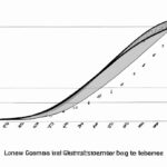
The Lorenz curve is a graphical representation showing income inequality in a society. It plots the cumulative share of total income against the corresponding population percentage. The curve’s shape indicates the distribution of income: a more equal society has a curve closer to the diagonal, while a more unequal society has a curve that bends away from it. By comparing different Lorenz curves, economists can assess the level of inequality and measure the extent to which income is concentrated in certain segments of society. This information helps policymakers develop strategies to address inequality and promote fairer distribution of wealth.
Table of Contents
- Calculation of Lorenz curve
- Definition of Lorenz curve
- Interpretation of Lorenz curve
- Limitations of Lorenz curve
- Use of Lorenz curve in measuring income inequality
(Gini Coefficient and Lorenz Curve)
The Lorenz curve is a graphical representation analyzing income inequality within a population. It was developed by economist Max O. Lorenz in 1905. The curve measures the cumulative distribution of income, comparing it to an ideal distribution of perfect equality.
At first glance, the Lorenz curve may appear like a simple line graph. However, it carries significant meaning. The curve plots the cumulative percentage of the population on the horizontal axis and the cumulative percentage of the total income held by that portion of the population on the vertical axis.
Ideally, in a society with perfect equality, the Lorenz curve would be a straight diagonal line. In reality, however, the curve deviates from this line. The greater the deviation, the more pronounced income inequality becomes.
To quantify income inequality, economists use a measure called the Gini coefficient. This coefficient is derived from the Lorenz curve. A Gini coefficient of 0 represents perfect equality, while a coefficient of 1 indicates complete inequality, with one person holding all the income.
The Lorenz curve and the Gini coefficient offer valuable insights into the distribution of wealth. By analyzing these measures, policymakers can identify areas of concern and formulate strategies to address income inequality. It helps to paint a comprehensive picture of a society’s economic landscape, fostering awareness and prompting action towards a more equitable future.
In conclusion, the Lorenz curve provides a tangible representation of income inequality within a population. Its analysis helps policymakers and economists understand the distribution of wealth and take steps towards a fairer society. By utilizing this tool, societies can work towards a more just and inclusive future.
Calculation of Lorenz curve
The calculation of the Lorenz curve is a fundamental aspect of understanding income distribution. It provides a graphical representation of inequality within a population by comparing the actual distribution of income or wealth to an ideal equal distribution.
To calculate the Lorenz curve, we first need to determine the cumulative percentage of total income or wealth held by each successive percentile of the population. This can be done by ranking individuals in ascending order according to their income or wealth and calculating the cumulative sum at each percentile.
Once we have the cumulative percentages, we plot them on the vertical axis against the corresponding percentile on the horizontal axis. The resulting curve represents the cumulative distribution of income or wealth in the population.
The Lorenz curve is always concave, starting from the origin and reaching the maximum possible distance from the line of equality, which represents perfect equality of income or wealth distribution. The greater the distance between the Lorenz curve and the line of equality, the higher the level of inequality in the population.
To compare the degree of inequality across different populations or time periods, we use a measure called the Gini coefficient. The Gini coefficient is calculated by taking the ratio of the area between the Lorenz curve and the line of equality to the total area under the line of equality. It ranges from 0 to 1, where 0 represents perfect equality and 1 represents maximum inequality.
The Lorenz curve and Gini coefficient provide valuable insights into the distribution of income or wealth within a population. By analyzing these measures, policymakers, economists, and researchers can better understand the level of inequality and design appropriate policies to address it.
In conclusion, the calculation of the Lorenz curve is a powerful tool for analyzing income or wealth distribution. By plotting cumulative percentages on a graph, we can visualize and quantify the level of inequality within a population. The resulting curve and the Gini coefficient allow for meaningful comparisons across different populations and time periods, providing valuable insights for policymakers and researchers.
Definition of Lorenz curve
The Lorenz curve is a graphical representation that shows the distribution of income or wealth among a population. It was named after the American economist Max O. Lorenz, who developed the concept in 1905.
The curve is drawn on a graph with the x-axis representing the cumulative percentage of the population and the y-axis representing the cumulative percentage of income or wealth. The curve starts at the origin and slopes upwards, indicating the accumulation of income or wealth as we move from the poorest to the richest individuals.
The Lorenz curve helps us understand income or wealth inequality within a society. It visually depicts how unequally income or wealth is distributed. A perfectly equal distribution would result in a straight diagonal line on the graph, while a highly unequal distribution would result in a curve that is significantly bowed away from the diagonal line.
A common measure of income or wealth inequality is the Gini coefficient, which can be derived from the Lorenz curve. The Gini coefficient ranges from 0 to 1, with 0 indicating perfect equality and 1 indicating extreme inequality. The closer the Gini coefficient is to 1, the more unequal the distribution of income or wealth.
By analyzing the Lorenz curve and the corresponding Gini coefficient, policymakers and researchers can assess the fairness of income or wealth distribution and design policies to address inequality. They can also compare different countries or regions to understand variations in inequality levels and trends over time.
The Lorenz curve has important implications for economic and social policy. High levels of income or wealth inequality can lead to social unrest, reduced social mobility, and slower economic growth. Governments often use policies such as progressive taxation and income redistribution to reduce inequality and promote social cohesion.
In conclusion, the Lorenz curve is a valuable tool for studying income or wealth distribution and measuring inequality within a population. It provides policymakers and researchers with a visual representation of the distribution and helps guide the development of policies to address inequality and promote economic and social well-being.
Interpretation of Lorenz curve
Interpretation of Lorenz curve can provide valuable insights into socioeconomic inequality within a population. This graphical representation, named after Max O. Lorenz, showcases the distribution of income or wealth among individuals. By plotting cumulative percentages of the population against cumulative percentages of income or wealth, it allows analysts to gauge the level of equality or inequality in a given society.
Examining the shape of the Lorenz curve provides a basis for interpretation. A perfect equality scenario would feature a 45-degree line, indicating that each percentile of the population possesses an equal share of income or wealth. In reality, however, such an equitable distribution is rare. Generally, the Lorenz curve will lie below the 45-degree line, symbolizing inequality.
The further the Lorenz curve is from the 45-degree line, the greater the extent of inequality. If the curve hugs the 45-degree line closely, it signifies a more equal distribution of resources. On the other hand, a curve that deviates significantly from the line reveals substantial disparities among individuals. For instance, if the curve lies far below the 45-degree line, it suggests that a small portion of the population possesses a disproportionate amount of income or wealth.
One can also calculate an inequality index, known as the Gini coefficient, from the Lorenz curve. This numerical measure quantifies the level of income or wealth concentration within a population. Ranging from 0 to 1, with 0 representing perfect equality and 1 indicating extreme inequality, the Gini coefficient allows policymakers and economists to compare and track inequality over time or across different nations.
Additionally, interpreting changes in the Lorenz curve over time is crucial for understanding socioeconomic trends. If the curve shifts closer to the 45-degree line, it signifies a reduction in inequality. Conversely, a curve moving further away from the line indicates an increase in inequality. By analyzing such changes, policymakers can assess the efficacy of redistributive measures and formulate strategies to promote a fairer society.
In conclusion, interpretation of the Lorenz curve provides valuable insights into socioeconomic inequality. By analyzing the shape of the curve, calculating the Gini coefficient, and examining changes over time, economists, policymakers, and researchers can gain a comprehensive understanding of the distribution of income or wealth within a population. This knowledge is crucial for designing strategies aimed at reducing inequality and fostering a fairer society.
Limitations of Lorenz curve
The Lorenz curve is a graphical representation that shows the distribution of income or wealth in a population. While it is widely used to understand inequality, it also has limitations that need to be considered.
One limitation of the Lorenz curve is that it only provides a snapshot of inequality at a specific point in time. It does not account for changes in income or wealth distribution over time. Therefore, it may not accurately reflect ongoing trends and dynamics in inequality.
Another limitation is that the Lorenz curve does not take into account factors such as education, health, or access to opportunities. It focuses solely on income or wealth, ignoring other dimensions of inequality that can contribute to disparities in well-being. This means that two individuals or households with the same income or wealth may have vastly different living conditions.
Furthermore, the Lorenz curve assumes that income or wealth distribution is a linear relationship, which may not always be the case. In reality, the distribution could be more complex, with certain groups experiencing disproportionate gains or losses. This simplification can oversimplify the complexities of inequality.
The Lorenz curve also does not provide information on the causes of inequality. It shows the extent of inequality, but not why it exists. To understand the underlying factors driving inequality, additional analysis and data are needed.
Lastly, the Lorenz curve is based on aggregate data and does not capture the experiences of individuals or households. It may mask intra-group inequalities and disparities within different social groups. For example, it may not capture gender-based or ethnic-based inequalities that exist within a population.
In conclusion, while the Lorenz curve is a useful tool for understanding and visualizing income or wealth inequality, it has its limitations. It is important to consider these limitations when using the Lorenz curve to avoid drawing incomplete or inaccurate conclusions about inequality. Additional measures and data are needed to provide a comprehensive understanding of inequality and its underlying causes.
Use of Lorenz curve in measuring income inequality
The Lorenz curve, an essential tool in economics, measures income inequality within a population. It visually represents the distribution of income across individuals. By plotting the cumulative percentage of total income against the cumulative percentage of the population, the Lorenz curve provides insight into the concentration of wealth.
To construct a Lorenz curve, income earners are sorted from lowest to highest. The cumulative percentage of income and population is then calculated for each income group. A line representing perfect equality, where each percentile of the population earns the same percentage of income, is also plotted. By comparing this line to the actual distribution, income inequality becomes evident.
The shape of the Lorenz curve reveals important information about wealth disparity. If the curve lies closer to the line of perfect equality, the income distribution is more equal. Conversely, if the curve bows away from the line, income inequality is pronounced. The wider the gap between the two lines, the greater the inequality within the population.
The Gini coefficient, derived from the Lorenz curve, quantifies income inequality. It measures the area between the Lorenz curve and the line of perfect equality. A Gini coefficient of zero indicates perfect equality, where every individual has an equal share of income. On the other hand, a coefficient of one represents maximum inequality, where one individual possesses all the income.
The Lorenz curve and Gini coefficient facilitate comparisons across different regions and time periods, providing policymakers with valuable information to address income inequality. Governments can use these tools to design policies that promote greater equality and social stability.
For instance, if the Lorenz curve indicates a significant wealth gap, policymakers may implement progressive tax reforms to redistribute income more equitably. Alternatively, investments in education and healthcare could be prioritized, as these can help lower-income individuals improve their economic prospects.
In conclusion, the Lorenz curve is a powerful tool for measuring income inequality. It visually represents how income is distributed within a population and allows for comparisons over time and across regions. By using the Lorenz curve and the Gini coefficient, policymakers can develop targeted strategies to reduce income disparities and foster greater economic and social well-being.