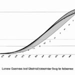
A Lorenz curve is a graphical representation used to analyze income distribution within a population. It was developed by Max O. Lorenz in 1905 and is often used in economics, sociology, and other social sciences. The curve plots cumulative income against the cumulative proportion of the population. By comparing the Lorenz curve to the line of perfect equality, which represents a situation where income is distributed evenly, one can observe the degree of income inequality in a society. The closer the Lorenz curve is to the line of equality, the more equal the income distribution.
(Gini Coefficient and Lorenz Curve)
The Lorenz curve is a graphical representation that measures income or wealth inequality within a population. It was developed by the American economist Max O. Lorenz in 1905. The curve is commonly used in economics and sociology to depict the distribution of income or wealth among individuals or households. The Lorenz curve is derived by plotting the cumulative percentage of income or wealth on the vertical axis against the cumulative percentage of the population on the horizontal axis. The curve typically starts at the origin (0,0) and ends at the coordinate (100,100). When the Lorenz curve is perfectly equal, it will be a straight line diagonal from the origin to the endpoint (100,100). This indicates that income or wealth is equally distributed among all individuals or households. However, in reality, the Lorenz curve deviates from this ideal line, indicating varying levels of inequality. The degree of inequality can be determined by calculating the Gini coefficient, which is derived from the area between the Lorenz curve and the ideal line of perfect equality. The Gini coefficient ranges from 0 to 1, with 0 representing perfect equality and 1 representing maximum inequality. Interpreting the Lorenz curve and Gini coefficient allows policymakers and researchers to assess the level of income or wealth inequality within a society. By understanding the distribution of resources, policymakers can design and implement policies to reduce inequality and promote greater economic and social inclusion. In summary, the Lorenz curve is a visual tool that provides insights into income or wealth inequality. It helps economists, sociologists, and policymakers better understand and address inequality issues in a population, aiming for fairer and more balanced distributions of resources.Construction of Lorenz curve
The construction of the Lorenz curve is a fundamental concept in economics that aims to measure income inequality within a particular population. The curve provides a visual representation of the distribution of income and helps in understanding how the wealth or income is distributed among individuals or households. To construct the Lorenz curve, we start by sorting the population from the lowest to the highest income. Next, we calculate the cumulative percentage of the total income that each segment of the population holds. This cumulative percentage is plotted on the y-axis, ranging from 0% to 100%. On the x-axis, we plot the cumulative percentage of the population. This axis also ranges from 0% to 100%, starting with the lowest-income segment and progressing to the highest. To create the Lorenz curve, we connect these plotted points in ascending order. The resulting curve illustrates the relationship between the cumulative percentage of the population and the cumulative percentage of the total income they hold. The closer the curve lies to the 45-degree line (known as the line of perfect equality), the more equal the income distribution is within the population. Conversely, if the curve deviates significantly from the line of perfect equality, it indicates a higher level of income inequality. The Lorenz curve can also be used to calculate a summary measure of income inequality called the Gini coefficient. The Gini coefficient represents the area between the Lorenz curve and the line of perfect equality divided by the entire area under the line of perfect equality. The coefficient ranges from 0 to 1, where 0 suggests perfect equality, and 1 indicates extreme inequality. The construction of the Lorenz curve helps policymakers, economists, and social scientists analyze income distribution patterns and identify areas of inequality. By visualizing the distribution of income, it provides a clear perspective on the disparities within a population and allows for comparisons between different groups or regions. Additionally, the Lorenz curve can also be used to evaluate the impact of policy interventions on income distribution. For example, if a government implements a program to reduce inequality, the Lorenz curve can be used to measure the effectiveness of the policy by analyzing any changes in the curve’s shape. In summary, the construction of the Lorenz curve provides a graphical representation of income inequality within a population. By plotting the cumulative percentage of the population against the cumulative percentage of the total income, it offers valuable insights into the distribution patterns and levels of inequality.
Definition of Lorenz curve
The Lorenz curve is a graphical representation of the distribution of income in a given population. It is a tool commonly used in economics to analyze income inequality within a society. The curve is named after the American economist Max O. Lorenz, who developed it in 1905. The Lorenz curve is constructed by plotting cumulative percentages of income against the cumulative percentage of the population. In other words, it presents the cumulative proportion of total income that belongs to a particular fraction of the population. By comparing the Lorenz curves of different societies or time periods, economists can measure and compare income inequality. The horizontal axis of the Lorenz curve represents the cumulative percentage of the population, ranging from the lowest to the highest income earners. The vertical axis represents the cumulative percentage of total income received. The curve starts at the origin (0,0), indicating that the bottom percentage of the population receives no income. As the curve climbs upwards, it shows the increasing share of total income captured by higher percentages of the population. Ideally, a society with perfect income equality would have a Lorenz curve that coincides with the diagonal line (known as the line of perfect equality). In such a case, each fraction of the population would receive an equal proportion of total income. However, in reality, most societies exhibit some degree of income inequality. The shape of the Lorenz curve provides insights into the distribution of income. The closer the curve is to the line of perfect equality, the more equal the income distribution. Conversely, a curve that deviates significantly from the line of perfect equality indicates higher levels of income inequality. To quantitatively measure income inequality using the Lorenz curve, economists often calculate the Gini coefficient. The Gini coefficient is a summary statistic derived from the Lorenz curve and ranges from 0 to 1. A value of 0 represents perfect income equality, while a value of 1 implies maximum income inequality. In conclusion, the Lorenz curve is a graphical tool that visually depicts the distribution of income within a population. It shows the cumulative percentage of total income earned by successive fractions of the population. By comparing the Lorenz curves of different societies or time periods, economists can assess and monitor income inequality. It plays a crucial role in the field of economics as a means to analyze the equity of income distribution and inform policy-making efforts aimed at addressing income inequality.
Interpretation of Lorenz curve
The interpretation of the Lorenz curve provides significant insights into income distribution within a given population. This curve, named after the economist Max O. Lorenz, depicts the relationship between the cumulative share of income or wealth held by individuals and the corresponding cumulative share of the population. The Lorenz curve is typically graphed as a curved line that starts at the origin and ends at the point representing perfect inequality, which is the maximum cumulative share of income held by a single individual or group. By analyzing this curve, we can gain a deeper understanding of the degree of income inequality in a society. The first key feature of the Lorenz curve is the degree of curvature it exhibits. The curve’s shape reveals the general pattern of income distribution within a population. If the curve is concave, it suggests a more equal distribution of income. Conversely, if the curve is convex, it indicates higher levels of income inequality, with a few individuals or groups capturing a larger share of the total income. Another important aspect to consider when interpreting the Lorenz curve is the distance between the curve and the line of perfect equality, often referred to as the line of perfect income distribution. This line represents a hypothetical scenario where income or wealth is distributed equally among all individuals. The greater the distance between the Lorenz curve and the line of perfect equality, the greater the level of income inequality in the society. An inequality index, known as the Gini coefficient, is commonly derived from the Lorenz curve. This coefficient, ranging from 0 to 1, quantifies the degree of income inequality within a population. A value of 0 represents perfect equality, indicating that everyone in the population has an equal share of income. On the other hand, a Gini coefficient of 1 signifies absolute inequality, with one individual or group holding all the income or wealth. Additionally, by examining specific points on the Lorenz curve, we can gather more detailed information about income distribution. For instance, the point corresponding to the 45-degree line, also known as the Lorenz Dominance point, indicates the share of income or wealth held by the middle class. A point below this line signifies that the majority of individuals in the population have a lower cumulative share of income compared to the middle class. Finally, the Lorenz curve allows policymakers and researchers to assess the effectiveness of various policies and interventions aimed at reducing income inequality. Changes in the Lorenz curve over time can help evaluate the impact of economic policies on income distribution and inform future decision-making. In conclusion, the interpretation of the Lorenz curve provides a comprehensive understanding of income distribution and inequality within a population. By analyzing the shape of the curve, the distance from the line of perfect equality, and the derived Gini coefficient, policymakers and researchers can gain valuable insights for addressing income inequality and promoting a fairer society.
Limitations of Lorenz curve
The Lorenz curve is a graphical representation of income inequality that shows the distribution of wealth or income within a population. While it is a useful tool for analyzing disparities, it is important to recognize its limitations. Here are some key limitations of the Lorenz curve: 1. Lack of granularity: The Lorenz curve provides an overall picture of income distribution, but it does not provide detailed information about specific income groups. It fails to capture the nuances within the economy, such as variations in income within different demographic groups or regions. 2. Dependency on data quality: The accuracy and reliability of the Lorenz curve are highly dependent on the quality of data used for its construction. If the data is incomplete, biased, or unreliable, the resulting curve may not accurately portray the true income distribution. 3. Focuses on a single dimension: The Lorenz curve mainly focuses on measuring income inequality using a single dimension, usually income or wealth. However, income inequality is a complex issue influenced by various factors such as education, social mobility, and opportunities. Thus, relying solely on the Lorenz curve may oversimplify the analysis of inequality. 4. Ignores non-monetary indicators: The Lorenz curve does not account for non-monetary indicators of well-being, such as access to healthcare, education, or social support. It fails to consider that individuals may have different levels of satisfaction with their lives even if their incomes are similar. 5. Difficulty in comparing across populations: Comparisons of the Lorenz curves between different populations or countries can be challenging since income distributions may not be directly comparable due to differences in currencies, purchasing power, or economic structures. 6. Limited in capturing changing dynamics: The Lorenz curve represents a static snapshot of income distribution at a particular point in time. It does not capture changing dynamics of inequality over time, such as how income mobility, economic policies, or external shocks affect the distribution of wealth. 7. Subjectivity in threshold determination: The Lorenz curve requires selecting a threshold for defining the population under analysis. This threshold is subjective and can affect the resulting curve. Different threshold choices may lead to different conclusions about income inequality. In conclusion, while the Lorenz curve is a valuable tool for understanding income distribution, it is essential to be aware of its limitations. These limitations highlight the need to complement the analysis with other statistical measures and indicators to gain a comprehensive understanding of inequality within a society.
Relationship between Lorenz curve and income distribution
The Lorenz curve is a graph that visually represents the distribution of income within a specific population. It provides valuable insights into the relationship between income distribution and various socioeconomic indicators. Examining the Lorenz curve can help us understand the extent to which income is concentrated or evenly distributed among individuals. The primary purpose of the Lorenz curve is to demonstrate income inequality. It plots the cumulative percentage of total income received by each segment of the population, starting from the smallest earners to the highest. The diagonal line, known as the line of perfect equality, represents a situation where income is evenly distributed among individuals. Any deviation from this line indicates inequality in income distribution. In situations where the Lorenz curve deviates significantly from the line of perfect equality, it suggests a high level of income inequality. The greater the distance between the Lorenz curve and the line of perfect equality, the more unevenly income is distributed. On the other hand, if the Lorenz curve is closer to the line of perfect equality, it indicates a more equal distribution of income. Analyzing the Lorenz curve allows us to calculate the Gini coefficient, which is a numerical measure of income inequality. The Gini coefficient ranges from 0 to 1, where 0 represents perfect equality and 1 represents extreme inequality. A higher Gini coefficient indicates a greater degree of income inequality within a population. The Lorenz curve also helps policymakers and researchers understand the impact of various policies on income distribution. For example, if a government implements progressive taxation, where higher earners are taxed at a greater proportion, it may lead to a more equitable distribution of income. This would be reflected in a Lorenz curve that is closer to the line of perfect equality. Conversely, if economic policies favor the wealthier segments of society, such as tax cuts for high-income individuals, the Lorenz curve may show a significant deviation from the line of perfect equality. This indicates that income is concentrated within a small percentage of the population, leading to greater income inequality. In summary, the relationship between the Lorenz curve and income distribution is crucial in assessing the equity or inequality within a population. By visually representing income distribution and calculating the Gini coefficient, the Lorenz curve provides policymakers and researchers with valuable insights into the impact of various policies and socioeconomic factors on income inequality.