The Lorenz curve displays income distribution graphically, indicating inequality. The Gini coefficient is a numerical measure calculated from the Lorenz curve, quantifying inequality. The Lorenz curve visually represents income distribution within a population. The Gini coefficient is a numerical value that summarizes the inequality observed in the Lorenz curve. A more equal distribution of income corresponds to a Lorenz curve closer to the line of perfect equality. The Gini coefficient ranges from 0 (perfect equality) to 1 (perfect inequality). The higher the Gini coefficient, the greater the level of income inequality in a society. The two concepts provide complementary insights into income inequality.
Table of Contents
- Calculation of Gini coefficient from Lorenz curve
- Construction of Lorenz curve
- Definition of Lorenz curve
- Interpretation of Lorenz curve
- Interpreting Gini coefficient
(Understanding the Gini Coefficient)
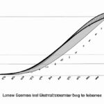
The Lorenz curve and Gini coefficient are tools used to measure income inequality. The Lorenz curve is a graph that compares the actual distribution of income in a population with an equal distribution. It plots the cumulative share of income held by the bottom x% of the population against the cumulative percentage of the population, showing the income distribution’s disproportionality.
The Gini coefficient, on the other hand, is a single numerical value that represents income inequality. It is derived from the area between the Lorenz curve and the line of perfect equality. The Gini coefficient ranges from 0, indicating perfect equality, to 1, indicating perfect inequality where one person holds all the income.
While the Lorenz curve visually depicts income inequality, the Gini coefficient provides a concise quantitative measure. The Lorenz curve is particularly useful for understanding the distribution pattern, while the Gini coefficient offers a summarized inequality statistic. Both tools help policymakers and researchers analyze and address economic disparities, guiding redistribution policies and societal changes. Understanding these concepts is crucial for creating more equitable societies and promoting sustainable economic growth.
Calculation of Gini coefficient from Lorenz curve
When it comes to understanding income inequality, the Lorenz curve and Gini coefficient play crucial roles. The Lorenz curve visually represents how wealth or income is distributed across a population, while the Gini coefficient quantifies this inequality into a single number. Let’s delve deeper into the process of calculating the Gini coefficient from a Lorenz curve.
Imagine you have plotted a Lorenz curve on graph paper, with cumulative percentage of population on the x-axis and cumulative percentage of income or wealth on the y-axis. This curved line showcases how evenly (or unevenly) resources are distributed among individuals in a society.
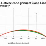
To calculate the Gini coefficient from this visual representation, we first need to determine the area between the Lorenz curve and the perfect equality line – also known as the Line of Equality. This imaginary straight line represents absolute equality where each person has an equal share of income or wealth.
The next step involves finding two areas: A representing total area under Line of Equality up to actual Lorenz Curve, and B symbolizing total area between Line of Equality and 45-degree diagonal line connecting point (0%, 0%) to point (100%, 100%). These areas help quantify inequality within our dataset.
Now here’s where things get interesting emotionally! Calculating Gini coefficient involves simple mathematics but carries profound implications about societal disparities. By dividing Area A by sum of Areas A+B, we obtain our final Gini coefficient value – typically ranging from 0 (perfect equality) to 1 (maximum inequality).
This numerical value reflects how far reality deviates from ideal egalitarian distribution; higher values indicating more significant disparities among individuals’ incomes or wealth shares within that population. It paints a poignant picture revealing not just numbers but real people impacted by economic imbalances.
So there you have it – through intricate calculations intertwined with emotive significance, we unravel insights into social equity using both Lorenz curves and their distilled essence, the evocative Gini coefficients.
Construction of Lorenz curve
When delving into the construction of a Lorenz curve, we embark on a journey that unveils the essence of income distribution. Picture this: you have society’s population lined up in ascending order based on their respective incomes—a real-life human hierarchy captured by data points waiting to tell a story.
To construct the Lorenz curve, we start with these individuals neatly arranged by income level. Then, we calculate what portion of total income each segment of the population holds. The bottom 20% may only claim 10% of all earnings while the top 20% might enjoy a whopping 50%. These percentages shape our understanding of societal wealth disparity and lay the foundation for drawing the infamous curved line known as the Lorenz curve.
As we plot this curve on graph paper—its X-axis representing cumulative proportions of people from poorest to richest and Y-axis showcasing cumulative proportions of total income—we witness its elegant arc taking shape. Each bend and contour speaks volumes about how equitably or unequally riches are distributed among members of society.
Emotions run high as we observe this visual representation unfold before our eyes. There is beauty in its simplicity yet profound complexity in what it signifies—the harsh reality that not everyone shares in economic prosperity equally.
With each percentile added along our X-axis, another layer is unveiled—one that exposes stark contrasts between those at the summit basking in opulence and those at rock bottom grappling with scarcity. The curvature tells tales without uttering a word; it screams social injustice where privilege reigns supreme for some while others languish in poverty’s grip.
The Lorenz curve becomes more than just lines and coordinates—it transforms into a poignant narrative illustrating societal inequities etched deep within our economic landscape. It challenges us to confront uncomfortable truths about wealth distribution and beckons us to strive for fairer systems where every individual has an equitable shot at prosperity.
In conclusion, constructing a Lorenz curve isn’t merely an academic exercise—it’s an emotional odyssey through realms of privilege, disparity, and hope for a more just tomorrow.
Definition of Lorenz curve
Alright, let’s delve into the world of economics with a focus on the fascinating concept of the Lorenz curve. Picture this: imagine you have a graph that represents income distribution in a society. The Lorenz curve is like an X-ray revealing the economic heartbeat of a nation.
The beauty of the Lorenz curve lies in its simplicity and power to show inequality visually. It’s named after American economist Max O. Lorenz who devised it back in 1905 as a way to analyze wealth distribution patterns.
When you see a Lorenz curve plotted, it often resembles a bow-shaped line snaking across the graph paper, showing how much richer certain sections are compared to others. The x-axis typically displays cumulative percentage of population (from poorest to richest), while the y-axis indicates cumulative percentage of total income they possess.
As you trace along this beguiling curve, flitting from point A representing the poorest folks to point B where the wealthiest reside, emotions stir within you—empathy for those struggling at one end juxtaposed with awe or perhaps even resentment towards excessive affluence at another.
At its core, what makes studying and interpreting these curves crucial is their ability to unveil societal disparities starkly—an eye-opening window into understanding which segments are reaping most benefits versus those left scraping by on crumbs from life’s table.
With each bend and dip observed on the meticulous charting out of incomes over people, your heart may ache witnessing vast gulfs between haves and have-nots laid bare before your eyes—a silent testament echoing injustices etched deep into our socioeconomic fabric.
But don’t despair just yet! For beyond these jarring realities lie opportunities for change—for policies crafted with compassion; initiatives promoting equity over privilege; movements rallying behind solidarity rather than division—it all begins with grasping nuances hidden within lines and slopes defining our societies’ financial landscapes through lenses tinted by hope and resolve.
(Lorenz Curve and Gini Coefficient – Measures of Income Inequality)
Interpretation of Lorenz curve
When you dive into the realm of income distribution analysis, one crucial tool that comes to play is the Lorenz curve. Picture this: a visual representation showcasing how evenly or unevenly a certain resource – like income or wealth – is distributed among a population. The Lorenz curve takes you on a revealing journey as it plots cumulative percentages of total income against the cumulative percentage of recipients.
As you gaze upon this graphical marvel, emotions can run high. It’s like peering through a window offering insights into societal disparities and economic inequalities. The line drawn may be smooth, indicating fair distribution where everyone holds an equal slice of the pie—or jagged, highlighting stark differences between haves and have-nots.
Peeling back another layer reveals that perfect equality forms a 45-degree diagonal line on your graph—a utopian dream where each percentile earns precisely their corresponding share without any variance. Sadly, reality often deviates from this ideal scenario.
Imagine yourself standing at the point (0%, 0%) on this chart—representing zero percent of individuals holding no portion of income—and tracking along with increasing percentages until you reach (100%, 100%), symbolizing all income held by 100% of people in society. This trajectory unveils how concentrated resources are within select segments compared to others.
The Gini coefficient then steps onto the stage as your guide for quantifying these nuances in distribution patterns laid out by the Lorenz curve. Instead of just showing trends visually, it assigns a numerical value lying between zero and one—all while wielding statistical power to pinpoint inequality levels more accurately than its graphical counterpart alone can achieve.
In essence, think of Lorenz curves as artistic expressions painting vivid pictures of economic realities; they beckon us closer to scrutinize disparities etched across society’s fabric with meticulous detail—an invitation not easily declined once curiosity stirs within our hearts and minds alike.
Interpreting Gini coefficient
Understanding the Gini coefficient is like peering into a window that reveals the economic inequality within a society. This numerical value, usually ranging from 0 to 1, serves as a compass guiding policymakers and economists in navigating the complex landscape of income distribution.
When you look at the Gini coefficient, think of it as a storyteller whispering tales of disparity or equity among individuals in a given population. A high coefficient closer to 1 signifies significant inequality – imagine a city where a few wealthy tycoons own towering skyscrapers while many struggle to make ends meet.
On the flip side, if the coefficient hovers near 0, picture an ideal utopia where resources are evenly spread out like rays of sunshine on a clear summer day. Here, everyone enjoys similar access to education, healthcare, and opportunities for growth.
Interpreting this dancing number requires more than just crunching data; it demands empathy and understanding of human experiences woven into statistical threads. It’s about acknowledging that behind every decimal point lies countless stories of triumphs and hardships borne by real people striving for better lives.
Imagine standing at a crossroads with two paths diverging starkly: one leading to prosperity and abundance while the other meanders through shadows of deprivation and want. The Gini coefficient points us towards these divergent roads, prompting introspection on societal structures that either hinder or foster inclusive growth.
As we delve deeper into interpreting this enigmatic figure etched on graphs and reports, let’s not forget its profound implications on social cohesion and collective well-being. A rising Gini coefficient may signal looming unrest simmering beneath apparent calmness—a call to action for policymakers to bridge gaps before they widen beyond repair.
In essence, deciphering the Gini coefficient transcends mere numeric analysis; it entails unraveling narratives buried beneath layers of statistics—stories yearning to be heard, understood, and reshaped towards building fairer societies where each individual’s potential can bloom unhindered by systemic inequalities.


