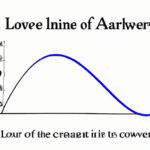
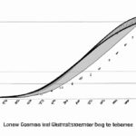
The Lorenz curve showcases income distribution by comparing actual distribution with equal distribution. Income inequality is visually displayed.
Table of Contents
- Application in Economics
- Criticisms
- History of the Lorenz curve
- Interpretation
- Mathematical Representation
(Gini Coefficient and Lorenz Curve)
The Lorenz curve is a graphical representation of income or wealth distribution within a population. It highlights inequality by comparing the actual distribution to a perfectly equal distribution where everyone earns or owns an equal share. The curve is typically displayed on a graph where the horizontal axis represents the cumulative percentage of the population, while the vertical axis shows the cumulative percentage of income or wealth. The closer the curve is to the line of perfect equality, the more equal the distribution. In contrast, a curve bending away from the line indicates greater inequality. This visual representation allows policymakers and economists to assess the degree of inequality in a society and develop measures to address it. The Gini coefficient is often used in conjunction with the Lorenz curve to provide a single numerical value quantifying the level of inequality. Understanding the Lorenz curve is crucial for analyzing societal disparities and designing effective policies to promote a fairer distribution of resources.
Application in Economics
The application of the Lorenz curve in economics provides a visual representation of income inequality within a specific population. By plotting the cumulative share of income against the cumulative share of the population, economists can analyze and compare wealth distribution patterns. This method allows for a deeper understanding of economic disparities and helps policymakers make informed decisions to address social inequities.
Imagine standing at an intersection where two roads diverge – one leading to prosperity and abundance, while the other veers off into poverty and deprivation. The Lorenz curve vividly depicts this divergence by showcasing how unequally incomes are distributed among individuals or households within a society. It paints a picture that speaks volumes about societal structure, revealing stark contrasts between affluence and destitution.
Economists use this tool to calculate key metrics such as the Gini coefficient, which quantifies income inequality on a scale from 0 (perfect equality) to 1 (maximum inequality). Picture it as a compass guiding policymakers towards fairer policies aimed at bridging the gap between the haves and have-nots. It serves as a beacon shining light on areas needing attention and intervention to foster inclusive growth.
As you delve deeper into economic landscapes painted by the Lorenz curve, emotions may stir within you – empathy for those struggling at the lower end of the curve juxtaposed with admiration for those thriving near its pinnacle. These emotional responses humanize what might otherwise be dry data points, reminding us that behind every statistic lies real people grappling with financial challenges or enjoying abundant opportunities.
When governments analyze these curves alongside other economic indicators, they gain valuable insights into crafting policies that promote upward mobility and reduce barriers hindering progress for marginalized communities. Through targeted interventions like progressive taxation or investment in education and healthcare, societies can aspire towards greater equity reflected in more balanced Lorenz curves.
In conclusion, integrating the Lorenz curve into economic analyses isn’t just about crunching numbers; it’s about weaving together stories of hopes dashed or dreams realized amid varying degrees of prosperity. Its impact reverberates through policy corridors shaping destinies and altering trajectories towards a more equitable future where everyone has a chance to thrive.
Criticisms
Criticism of the Lorenz curve has sparked debates among economists and statisticians. Some argue that it oversimplifies complex income distributions, painting a skewed picture of inequality. They claim that by condensing data into one graph, nuances get lost in translation; the intricacies of wealth disparities vanish behind a single line.
Others point out its inability to account for non-monetary forms of wealth—like access to education or healthcare—which significantly impact someone’s standard of living but remain unseen on this visual representation. It’s like trying to capture the essence of an ocean within a drop; the true depth remains unexplored.
Moreover, critics highlight how small sample sizes can lead to misleading conclusions when constructing Lorenz curves. A few outliers could heavily influence the shape of the curve, distorting perceptions of equality or inequality within a population. Imagine building a sandcastle with shaky foundations—it might look impressive at first glance, but upon closer inspection, cracks start appearing.
There are also concerns about relying solely on Gini coefficients derived from Lorenz curves as measures of inequality since they offer only a snapshot rather than a panoramic view. It’s akin to judging an entire book based on its cover without delving into its chapters—the full narrative lies undiscovered beneath superficial analyses.
Despite these criticisms, supporters defend the Lorenz curve as a valuable tool for illustrating income disparities succinctly and visually—a starting point for discussions around economic equity and policy-making decisions. Like using colors in art to evoke emotions hidden beneath layers of paint strokes, so does this curve hint at societal imbalances awaiting exploration.
In conclusion, while criticisms challenge the simplicity and limitations inherent in the Lorenz curve methodology, they serve as catalysts for refining our understanding of wealth distribution intricacies beyond mere percentages and figures—a reminder that reality is multidimensional and cannot be encapsulated entirely by any single mathematical construct alone.
History of the Lorenz curve
The Lorenz curve, a graphical representation developed by Max O. Lorenz in 1905, revolutionized the way economists analyze income inequality. Picture this: A curved line elegantly weaving through a graph, portraying the distribution of wealth among a population with unparalleled precision. It’s like peeking into society’s wallet and seeing how money is divvied up.
Lorenz was inspired by his desire to measure economic disparities more accurately than traditional methods allowed. He ingeniously devised a tool that could visually capture the concentration of wealth within a population. This revolutionary curve became central to understanding income inequality and social justice over time.
Initially used to study agricultural production, the Lorenz curve gained prominence as economists recognized its potential beyond land distribution analysis. Imagine researchers poring over data points on graphs, uncovering hidden patterns in society’s financial makeup – it’s detective work with numbers!
With each plotted point on the curve representing different portions of society sorted from poorest to richest, policymakers can spot trends impacting societal welfare at a glance. The curves mirror reality with eerie accuracy – showcasing often uncomfortable truths about who holds power (and money) in any given community.
Over time, economists refined their methodologies for constructing these curves, making them even more nuanced and revealing than before. Think of it like upgrading your eyeglass prescription; suddenly everything becomes clearer and sharper – no detail escapes unnoticed.
As globalization reshaped economies worldwide post-World War II, interest in studying income disparities soared alongside growth rates. The allure of unearthing economic secrets using Lorenz curves fueled research fervor across continents – picture scholars huddled around desks cluttered with papers and coffee mugs as they grapple with unraveling complex societal puzzles all captured within those elegant lines.
In essence, the history of the Lorenz curve mirrors humanity’s quest for fairness and balance amid shifting economic landscapes throughout history—a powerful reminder that every twist and turn has implications far beyond mere graphs or statistics.
(Understanding the Gini Coefficient)
Interpretation
When delving into the world of economics, one often encounters complex concepts like the Lorenz curve. Interpreting this curve involves understanding its crucial role in illustrating income inequality within a given population. Picture it as a visual narrative that unfolds the economic disparities among individuals or households.
As you gaze at the curve’s shape on a graph, you see how it bends and weaves, revealing insights about distribution patterns. It portrays who has more and who has less, painting a vivid picture of societal wealth gaps with every peak and valley.
The interpretation of a Lorenz curve hinges on its proximity to the line of perfect equality – a diagonal reference point where each percentile holds an equal share of income. The further away the Lorenz curve strays from this ideal line, the greater the income disparity present in society. This departure signifies skewed distributions – some hold vast riches while others struggle to make ends meet.
Analyzing this deviation stirs emotions ranging from empathy for those at the lower end to curiosity about what factors contribute to such imbalances. You may feel compelled to question societal structures and policies driving these unequal outcomes.
Furthermore, interpreting multiple Lorenz curves allows for comparative analysis between different regions or time periods. Contrasting these curves reveals shifts in income distribution over time or disparities between diverse populations – prompting reflection on socio-economic progress or regression.
Engaging with these interpretations fosters awareness and calls for action towards creating more equitable societies. The emotional resonance sparked by witnessing stark inequalities ignites conversations around fairer wealth distribution and access to resources for all members of society
In conclusion, decoding the Lorenz curve goes beyond mere statistical analysis; it illuminates real-world struggles faced by individuals across various economic strata. It evokes empathy, prompts critical thinking about social systems, and inspires advocacy for inclusive policies that strive towards bridging income divides.
Mathematical Representation
When delving into the realm of understanding how inequality is portrayed in economics, the Lorenz curve emerges as a pivotal tool. Essentially, it’s a graphical representation that showcases income distribution within a specific population. Picture this: imagine a graph where along the bottom axis we have cumulative percentages of households ranked from poorest to richest, and on the vertical axis, we depict the corresponding cumulative share of total income those households possess.
The beauty lies in its visual impact – you can almost feel the pulse of societal wealth distribution through its curves and slopes. A gentle upward curve signifies more equity – each percentile gaining an equal slice of the pie. However, if that line bows steeply before reaching equality, revealing stark gaps between rich and poor sections of society, it reflects pronounced income inequality.
Now let’s talk about its mathematical underpinnings because while visually striking, it also speaks volumes through numbers. The diagonal line running from 0% to 100% represents perfect equality; every household holds an identical portion of income. By contrasting this with the actual distribution revealed by our curved line on the graph unveils disparities vividly.
To quantify this disparity mathematically, economists often use a metric called Gini coefficient derived from area calculations beneath these two lines on our Lorenz curve plot; A value closer to zero indicates high equality while nearing one points towards extreme inequality levels piercing hearts with harsh realities faced by many in unequal societies worldwide.
But behind these formulas lie stories—stories of families scraping by at subsistence levels while others swim in abundance merely due to birth circumstances or systemic advantages stacked against them. The Lorenz curve isn’t just lines and figures; it’s a narrative—a reflection capturing not only economic truths but human struggles for fairness and dignity amidst societal frameworks still grappling with profound imbalances.
