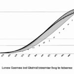
The Lorenz curve is a graphical representation used to analyze the distribution of income or wealth within a population. Constructing a Lorenz curve involves a series of steps. First, the data must be sorted based on income or wealth levels from lowest to highest. Next, the cumulative percentage of the total income or wealth is calculated for each corresponding group. A graph is then created, with the cumulative percentage on the y-axis and the cumulative percentage of the population on the x-axis. Finally, a line of equality is drawn to represent perfect equality, and the Lorenz curve is plotted by connecting the cumulative percentage points on the graph. The resulting curve visually illustrates income or wealth inequality within a society.
(Lorenz Curve | Class 11 Economics Measures of Dispersion)
The Lorenz curve is a graphical representation that highlights the distribution of income within a given population. It was developed by Max O. Lorenz, an American economist, in 1905. The curve is widely used to measure income inequality and understand the concentration of wealth in a society. To construct the Lorenz curve, you start by arranging the population from the poorest to the richest individuals. Then, you plot the cumulative percentage of income received on the y-axis against the cumulative percentage of the population, ranked by income, on the x-axis. The curve begins at the bottom-left corner, representing the section of the population with the lowest income and the lowest cumulative percentage. As you move along the x-axis, the curve gradually rises to track the cumulative percentage of the population up to 100%. At any given point, the y-value on the curve represents the cumulative percentage of the total income earned by the corresponding portion of the population. Ideally, in a perfectly equal society, the Lorenz curve would coincide with the line of perfect equality, which is a diagonal line from the origin to the top-right corner. However, in reality, the Lorenz curve lies below this line, indicating income inequality. A comparison between the Lorenz curve and the line of perfect equality provides insights into the degree of inequality. The greater the distance between the Lorenz curve and the line of perfect equality, the more pronounced the income inequality within the society. The area between the Lorenz curve and the line of perfect equality is often shaded to visualize and estimate the magnitude of income disparity. By analyzing and interpreting the Lorenz curve, policymakers and economists are able to assess the distribution of wealth and implement measures to address income inequality. The Lorenz curve is a valuable tool for evaluating socioeconomic disparities and can contribute to informed decision-making in the pursuit of more equitable societies.Applications of Lorenz curve
The Lorenz curve, named after economist Max O. Lorenz, is a graphical representation of income inequality within a specific population. It is commonly used in economics and social sciences to measure and analyze income distribution. The curve is particularly helpful in understanding the distribution of wealth or income within a society or region. Here are some applications of the Lorenz curve: 1. Income inequality analysis: The Lorenz curve visually depicts income inequality within a population. Policymakers, economists, and sociologists use it to study the distribution of income and how it changes over time. By examining the shape and slope of the Lorenz curve, analysts can determine the level of income inequality in a specific area and make informed decisions regarding equitable economic policies. 2. Poverty measurement: The Lorenz curve is closely related to the Gini coefficient, which quantifies the degree of income inequality in a region. Using the Lorenz curve, policymakers can assess the extent of poverty within a population. By comparing the Lorenz curve with the line of perfect equality, analysts can identify the percentage of the population living below the poverty line. 3. Evaluation of social programs: The Lorenz curve provides a useful tool for evaluating the effectiveness of social programs aimed at reducing income inequality. By comparing Lorenz curves before and after implementing a particular policy or program, policymakers can determine its impact on income distribution. This information helps in making evidence-based decisions on social programs and policies. 4. International comparisons: The Lorenz curve can be used to make comparisons across different countries or regions. By examining the Lorenz curves, policymakers and researchers can assess the income distribution and income inequality levels in various nations. This analysis can inform discussions on global economic disparities and international development. 5. Wealth distribution analysis: In addition to income, the Lorenz curve can also be used to analyze the distribution of wealth within a population. Wealth inequality is often a crucial aspect of economic disparity, and the Lorenz curve can provide insights into the concentration of wealth among different segments of society. 6. Policy formulation: The Lorenz curve plays a vital role in informing policy decisions aimed at reducing income or wealth inequality. By studying the shape of the Lorenz curve, policymakers can identify areas where interventions are needed to achieve a more equitable distribution of resources. The information provided by the Lorenz curve helps in developing targeted policies aimed at reducing poverty and promoting economic growth. In conclusion, the Lorenz curve is a powerful tool for understanding income and wealth inequality within a population. Its applications range from assessing income distribution and poverty levels to evaluating the effectiveness of social programs. By analyzing the Lorenz curve, policymakers and researchers can make informed decisions to address disparities and promote a more equitable society.
Construction of Lorenz curve
The construction of the Lorenz curve is a fundamental concept in economics used to measure income or wealth inequality within a society. It visually represents the distribution of income or wealth among a population and provides insights into the degree of inequality that exists. To construct the Lorenz curve, we rely on the cumulative distribution function (CDF) of income or wealth. The CDF shows what percentage of income or wealth is owned by a certain percentage of the population. The Lorenz curve then plots the CDF against the cumulative percentage of the population. To illustrate the construction process, let’s consider the distribution of income among a population of 100 individuals. We first need to order the individuals from lowest to highest income. Then, we calculate the cumulative percentage of the population (X-axis) and the cumulative percentage of income (Y-axis). Starting from the lowest income, we assign the first individual a cumulative percentage of population of 1% (as there is only one person). We calculate the cumulative percentage of income that this person represents and mark this point on the Lorenz curve. Moving to the next individual, we adjust the cumulative percentage of population to reflect the addition of this person. For example, if the second individual represents 2% of the population, then the cumulative percentage of the population becomes 3% (1% + 2%). We calculate the cumulative percentage of income this person represents, mark the point on the curve, and connect it to the previous point. This process continues for each individual, adjusting the cumulative percentages of population and income at each step until we reach the highest income. Connect each point on the curve to form a smooth line, and the Lorenz curve is complete. Interpreting the Lorenz curve is key in understanding income or wealth inequality. The closer the Lorenz curve is to the diagonal line (the line of perfect equality), the more equal the distribution of income or wealth. In contrast, the further away the curve is from the diagonal, the greater the inequality. The area between the Lorenz curve and the diagonal represents the degree of inequality, with a larger area indicating higher inequality. Economists commonly use a summary statistic called the Gini coefficient to quantify inequality using the Lorenz curve. The Gini coefficient is a number between 0 and 1, where 0 represents perfect equality and 1 represents perfect inequality. It measures the ratio of the area between the Lorenz curve and the diagonal to the total area under the diagonal. In conclusion, the construction of the Lorenz curve provides a visual representation of income or wealth distribution within a population. By analyzing the curve and computing the Gini coefficient, economists can gain valuable insights into the degree of inequality within a society.
Definition of Lorenz curve
The Lorenz curve is a graphical representation of income or wealth distribution within a population. It is named after Max O. Lorenz, an American economist who developed it in 1905. Lorenz curves are commonly used to analyze how resources are distributed among individuals or households, and are widely used in fields such as economics, sociology, and public policy. The Lorenz curve visually demonstrates the degree of inequality in a society by plotting cumulative income or wealth of a given population against the equally divided population. On the graph, the x-axis represents the cumulative share of the population, ranging from 0% to 100%. The y-axis represents the cumulative share of total income or wealth held by the corresponding x-axis population. The Lorenz curve starts from the bottom left corner of the graph, representing an equal distribution of income or wealth in a hypothetical perfectly equal society. As the curve moves upwards and towards the right, it signifies the accumulation of income or wealth among the richer segments of the population. The more curved the line is, the greater the level of inequality in the society. The Lorenz curve helps to quantify the level of income or wealth inequality by providing a measure known as the Gini coefficient. The Gini coefficient ranges from 0 to 1, where 0 represents perfect equality (everyone has the same income or wealth) and 1 represents extreme inequality (all income or wealth is held by a single individual or group). The Gini coefficient is calculated by dividing the area between the Lorenz curve and the line of perfect equality by the total area below the line of perfect equality. The Lorenz curve and the Gini coefficient provide a comprehensive way to compare income or wealth disparities across different countries, regions, or time periods. They help policymakers and researchers gain insights into the patterns of income or wealth distribution, and can be used to evaluate the effectiveness of government policies aimed at reducing inequality. In summary, the Lorenz curve is a graphical representation that enables us to visualize and quantify income or wealth inequality within a population. It serves as a vital tool for understanding and analyzing the distribution of resources in society, and is an essential component of research and policy discussions concerning economic disparities.
Interpretation of Lorenz curve
Interpretation of Lorenz Curve: The Lorenz curve is a graphical representation used in economics to analyze income distribution within a population. It provides insights into the degree of inequality and allows for a comparison of income disparities among different regions, countries, or time periods. The interpretation of the Lorenz curve is critical in understanding the distribution of wealth and assessing the equity of a particular economic system or policy. The Lorenz curve is plotted by ranking individuals or households based on their income, from the poorest to the richest, along the horizontal axis. On the vertical axis, it represents the cumulative share of total income earned by that portion of the population, ranging from 0 to 100 percent. By plotting these cumulative shares, the Lorenz curve provides a visual representation of income distribution. The Lorenz curve interpretation is straightforward: the closer the curve is to the perfect line of equality, the more equal the income distribution. If the Lorenz curve coincides with the line of equality (a straight 45-degree line from 0 to 100 percent), it indicates perfect income equality, where every individual or household has an equal share of the total income. Conversely, a Lorenz curve that diverges significantly from the line of equality suggests a high level of income inequality. The area between the Lorenz curve and the line of equality, known as the Lorenz area or the Gini coefficient, quantifies the extent of income inequality. The Gini coefficient is a concise measure of income distribution, ranging from 0 to 1. A Gini coefficient of 0 signifies perfect equality, while a coefficient of 1 represents extreme inequality. In addition to assessing overall income inequality, the Lorenz curve allows for comparisons between different populations. By overlaying multiple Lorenz curves, analysts can compare income distributions across regions, countries, or time periods. This comparative analysis provides valuable insights into the effectiveness of policies aimed at reducing income disparities. Moreover, the interpretation of the slope of the Lorenz curve is integral to understanding income concentration. A steeper slope indicates a higher concentration of income, suggesting that a small portion of the population controls a significant share of the total income. Conversely, a flatter slope represents a more evenly spread income distribution, with a larger share of the population having access to a proportionate amount of income. In conclusion, the interpretation of the Lorenz curve is crucial for understanding income inequality within a population. By analyzing the curve’s shape, the divergences from the line of equality, and the Gini coefficient, economists can assess the level of income disparities and evaluate the equity of a specific economic system or policy. The Lorenz curve provides a valuable tool in promoting informed decision-making and shaping more equitable societies.
Limitations of Lorenz curve
The Lorenz curve is a graphical representation of income or wealth distribution within a population. While it is a useful tool for analyzing economic inequality and measuring social welfare, there are certain limitations to consider when using the Lorenz curve. These limitations can be categorized into data limitations, assumptions, and interpretational limitations. Data Limitations: 1. Inadequate Data: The construction of the Lorenz curve requires precise and accurate data on income or wealth distribution. However, the availability of such data can be limited, particularly in developing countries or regions where data collection is challenging. 2. Lack of Granularity: The Lorenz curve does not provide a detailed breakdown of income or wealth distribution within different population segments or groups. It fails to capture variations in inequality between different demographics, such as age, race, or occupation. Assumptions: 1. Income Homogeneity: The Lorenz curve assumes that everyone within a population has the same preferences, tastes, and abilities. It does not account for income disparities arising from differences in skills, education, or productivity. In reality, income inequality can be influenced by various factors beyond just the distribution of resources. 2. Static Analysis: The Lorenz curve assumes a static distribution of income or wealth at a given point in time. It fails to capture changes in inequality over time, which can result from factors such as economic growth, social policies, or fluctuations in market conditions. Consequently, the Lorenz curve may not be suitable for analyzing dynamic income or wealth distributions. Interpretational Limitations: 1. Lack of Context: The Lorenz curve provides a snapshot of income or wealth distribution but does not provide information on the underlying causes or consequences of inequality. It does not consider factors such as social mobility, access to education and healthcare, or economic opportunities, which can significantly impact individuals’ well-being. 2. Simplification of Inequality: The Lorenz curve reduces the complexity of income or wealth distribution to a single line. Although it offers a visual representation of inequality, it oversimplifies the multidimensional nature of economic disparities. Other dimensions of inequality, such as gender, race, or social class, are not explicitly accounted for. In conclusion, while the Lorenz curve offers valuable insights into income or wealth distribution, it has several limitations. These limitations stem from data availability, assumptions made, and interpretational constraints. It is important to be aware of these limitations and to consider complementary methods for a more comprehensive understanding of inequality within a population.