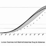
The Lorenz curve shows income distribution and is essential to measure inequality in economies. Calculating the curve involves plotting cumulative income against the cumulative proportion of the population. A perfect equality scenario results in a diagonal line from the origin to the top right corner of the graph. In real-life cases, the curve lies below this line indicating inequality. The further the curve from the diagonal line, the higher the inequality. Researchers and policymakers use the Lorenz curve to understand income disparities, develop appropriate policies, and ensure fair distribution of wealth among the population.
Table of Contents
- Construction of Lorenz curve
- Definition of Lorenz curve
- Interpretation of Lorenz curve
- Limitations of Lorenz curve.
- Purpose of Lorenz curve analysis
(Gini Coefficient and Lorenz Curve)
The Lorenz curve is a graphical representation of income or wealth distribution within a population. It is a visual tool to demonstrate inequality, with the perfect equality line being a diagonal line from the bottom left to the top right. To calculate the Lorenz curve, one first arranges the population from poorest to richest. Then, the cumulative percentage of income or wealth is plotted against the cumulative percentage of the population, resulting in the Lorenz curve. The further the Lorenz curve is from the equality line, the greater the level of inequality in the distribution. Measuring the distance between the Lorenz curve and the equality line gives the Gini coefficient, a numerical representation of inequality. Countries with a higher Gini coefficient experience more income or wealth inequality. The Lorenz curve analysis plays a crucial role in assessing economic disparities, guiding policymakers to implement measures to address inequality issues effectively. Understanding how to interpret and analyze the Lorenz curve is essential in shaping equitable wealth distribution policies.
Construction of Lorenz curve
Constructing a Lorenz curve involves plotting cumulative percentages of income or wealth against the corresponding cumulative proportions of people. Imagine a sheet of graph paper waiting to be filled with points that tell a story of inequality and distribution. Each dot represents an individual’s share in comparison to the overall percentage.
Picture yourself carefully marking each data point, feeling the weight of economic disparities as you connect them on your graph paper canvas. The line begins to take shape, bending and curving like the uneven roads we navigate through life.
As you plot these points, emotions may stir within you – empathy for those clustered at the bottom left corner, their sliver of pie barely visible; admiration for those whose dots soar high towards equity and abundance.
The process is both analytical and introspective. You are not just drawing lines; you are capturing societal dynamics, weaving together narratives of privilege and marginalization into a visual tapestry.
With each stroke of your pencil, you gain insight into how resources flow across populations – where they pool in concentration and where they dissipate in scarcity. It’s like deciphering a complex puzzle that speaks volumes about power structures and systemic inequalities ingrained in our world.
But amidst this complexity lies beauty – the beauty of knowledge gained, perspectives widened, and empathy cultivated. Through constructing a Lorenz curve, you tap into a deeper understanding of human interactions with money, revealing patterns that challenge assumptions and spark conversations for change.
So there it is: your completed Lorenz curve shining on the graph paper like a beacon calling attention to disparity’s shadowy corners. And as you gaze upon it with a mix of contemplation and resolve, remember that behind every plotted point lies someone’s reality – their struggles, aspirations, joys or sorrows reflected in statistical form.
In crafting this curve with care and intentionality, you contribute not only to economics but also to humanity itself – nudging us all towards greater awareness, compassion,and ultimately,a more equitable society.
Definition of Lorenz curve
The Lorenz curve, a graphical representation named after American economist Max O. Lorenz in 1905, portrays income or wealth distribution within a specific population. This curve provides a visual depiction of inequality patterns, comparing the cumulative share of total income received by individuals against the cumulative percentage of the population.
Imagine a community where everyone’s financial status is laid out on a line from lowest to highest income earners. The Lorenz curve swoops elegantly across this spectrum, showcasing how unequally or equally incomes are distributed among people.
To create this curve, economists sort individuals according to their incomes and calculate what portion of the total earnings each group holds. Then they plot these points on graph paper – revealing whether wealth is concentrated in few hands or spread more evenly among many.
In essence, if every person had an equal share of income or wealth – which would be represented as a straight diagonal line called equality line – society would achieve perfect equality. However, real-world scenarios show deviations from this ideal with some portions representing higher concentrations at lower-income levels while flattening towards the top for more equitable distributions.
When you look at a Lorenz curve that bows far away from that diagonal line towards one side- it signals significant disparities where only fewer individuals control larger portions of resources; but when it stays closer to the equality line—then there’s greater parity amongst members.
This graphical tool doesn’t just showcase numbers but conveys societal messages about fairness and inclusivity. It reveals stories behind data: struggles faced by marginalized communities striving for economic balance amidst prevailing inequalities.
Studying this curve can spark emotions – empathy for those struggling at economic fringes and motivation for policymakers seeking solutions to bridge gaps between rich and poor segments within society.
Thus, understanding and interpreting the Lorenz curve isn’t merely crunching numbers—it’s unraveling narratives woven into fabric illustrating who benefits most from shared prosperity efforts—and who might need additional support systems.
Interpretation of Lorenz curve
When you dive into the realm of understanding Lorenz curves, you’re stepping into a world where data dances to tell a story. The interpretation of a Lorenz curve is like deciphering the intricate brush strokes of an artist – every line and arc carries meaning.
Imagine this: picture a graph where on one axis, you have the cumulative percentage of wealth or income earners lined up from lowest to highest. Now, on the other axis, visualize the corresponding cumulative percentage of total wealth or income they possess. This dance between who has what unveils society’s distribution of resources in its rawest form.
As your eyes trace the curve meandering across this graph paper landscape, patterns begin to emerge – some subtle as a whisper, others bold as thunder. A perfectly equal society would boast a straight diagonal line known as the Line of Equality; each percentile holds an equal share of wealth or income.
However, reality often paints a different picture. The further away our curve bends from that ideal Line of Equality towards the bottom corner represents heightened inequality – where fewer individuals hold larger portions of society’s riches tightly in their grasp.
With each bend and sway in the Lorenz curve comes insight into societal structures and disparities within communities. Is it sloping gently upwards? Wealth concentration might be more evenly spread among citizens. But if it arches sharply towards one end? Brace yourself for glaring inequalities that demand attention.
Emotions can’t help but stir when faced with these visual representations – empathy for those unfairly left behind fuels advocacy for change while admiration may bloom for societies fostering equitable distributions against all odds.
Interpreting Lorenz curves isn’t just about crunching numbers; it’s about unraveling tales woven by economic landscapes where privilege mingles with disadvantage, shaping lives unseen yet deeply felt at every bend and turn along that curving path on your screen.
(Lorenz Curve and Gini Coefficient – Measures of Income Inequality)
Limitations of Lorenz curve.
The Lorenz curve, a tool in economics to show income distribution across a population, has its share of limitations. While it’s great for visually representing inequality with its curved line on a graph, there are factors that make it fall short.
One big limitation is that the Lorenz curve only measures inequality at one point in time. It doesn’t capture changes over time or show trends developing dynamically like our lives do – constantly shifting and evolving. Imagine freezing a video – you’d miss out on all the action happening before and after!
Another shortfall lies in its inability to account for non-monetary aspects of well-being like access to healthcare or education. Money isn’t everything; happiness doesn’t just come from dollar bills! So while the Lorenz curve paints a picture of income disparities, it’s blind to other crucial factors shaping people’s quality of life.
Moreover, when data used to create this curve lacks accuracy or representativeness, the whole story gets skewed. Think about trying to solve a jigsaw puzzle without all the pieces – frustrating and misleading! Inaccurate data leads us down rabbit holes of false conclusions rather than shedding light on real issues at hand.
Let’s not forget that human behavior can also throw off the Lorenz curve’s accuracy. People might underreport their earnings or find loopholes to hide wealth – skewing results and distorting our view of society’s true income distribution landscape.
Despite these limitations, though, we shouldn’t throw out the baby with the bathwater! The Lorenz curve still offers valuable insights into economic disparities within populations but should be complemented by other tools and perspectives for a fuller understanding.
In essence, while captivating in its simplicity and visual impact, the Lorenz curve has boundaries that need acknowledgment as we navigate through complex socioeconomic landscapes. Embracing its strengths while being mindful of its limitations ensures we craft more comprehensive solutions towards creating fairer societies where everyone stands an equal chance at prosperity.
Purpose of Lorenz curve analysis
The Lorenz curve analysis serves as a powerful tool in economics, shining a light on income distribution within a population. Imagine this: you have all the household incomes lined up from lowest to highest. The Lorenz curve then swoops in with its elegant arc, showcasing how equally or unequally these incomes are spread across society.
Delving deeper into this analysis reveals much about social equity and economic disparities that tug at our humanity. It’s like peering through a window into the soul of a community, seeing who thrives and who struggles under the weight of financial burdens.
As we plot these points on the graph and watch the curve take shape, emotions can run high. For those advocating for fairer policies, each bend in the line represents an opportunity to bridge gaps and uplift fellow humans facing hardship. On the flip side, for economists seeking efficiency and growth, it unveils areas where resources might be concentrated disproportionately – prompting critical questions about sustainability and societal well-being.
The purpose behind scrutinizing this curve isn’t just about numbers; it’s about people living real lives impacted by economic structures. When we witness steep slopes indicating vast inequalities, it stirs something within us – a sense of urgency to reevaluate systems that leave some drowning while others float effortlessly along waves of prosperity.
Moreover, using this analysis allows policymakers to craft targeted interventions aimed at redistributing wealth more equitably. By wielding data derived from such curves like compasses guiding them through rugged terrains of fiscal policy-making, they can steer towards horizons promising greater social harmony and justice.
In essence, studying Lorenz curves isn’t merely an academic exercise confined to ivory towers; it’s a moral imperative calling out for action rooted in empathy and fairness. It nudges us to look beyond percentages and decimals toward faces of individuals whose destinies are interwoven with intricate lines on graphs—a reminder that economics is not just a science but also an art profoundly influencing human experiences.


