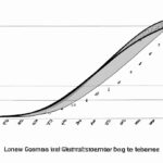
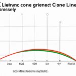
The Lorenz curve illustrates income inequality by comparing the cumulative share of income received by the population. A perfectly equal income distribution would form a straight line from the bottom left corner to the top right corner. In reality, the curve typically bends downwards, indicating inequality. The further away the curve is from the line of perfect equality, the greater the income disparity. Understanding the Lorenz curve helps policymakers address inequities and design effective redistribution policies. It encourages reflection on societal values and the distribution of resources, sparking conversations on fairness and social justice.
Table of Contents
- Construction of Lorenz curve
- Definition of Lorenz curve
- Interpretation of Lorenz curve
- Limitations of Lorenz curve.
- Purpose of Lorenz curve
(Lorenz Curve and Gini Coefficient – Measures of Income Inequality)
The Lorenz curve visually represents income inequality. It plots the cumulative share of total income against the cumulative percentage of the population. In a perfect equal society, the curve would be a straight diagonal line. However, in reality, it bends, showing the income disparities. The further the curve from the diagonal line, the higher the inequality. Hence, the Lorenz curve provides a powerful tool to understand and address income inequality effectively. It is commonly used in economics and social sciences to measure inequality and inform policy decisions. By analyzing the shape of the curve, policymakers can gauge the distribution of wealth and income within a society accurately. Additionally, the Gini coefficient, derived from the Lorenz curve, offers a numerical measure of income inequality. This metric ranges from 0 (perfect equality) to 1 (maximum inequality). Overall, the Lorenz curve is an essential tool for policymakers, economists, and researchers striving to create a more equitable society for all its members.
Construction of Lorenz curve
The construction of a Lorenz curve is like painting a picture that tells the story of income distribution in society. Imagine you have data on individual incomes, from the lowest earners to the highest. To begin creating this curve, you arrange these individuals in ascending order according to their income levels.
Next, you calculate the cumulative percentage of total income held by each percentile of the population starting from the poorest and moving towards the richest. This process forms points along your graph – marking how much wealth accumulates as you move across different segments of society.
As you connect these plotted points with smooth curves, an elegant shape emerges on your chart. The curve starts at the bottom left corner, representing those at the lowest income level holding minimal wealth. It gradually ascends but does so unevenly – showcasing how disparities in earnings widen among different sections of society.
Each bend and slope in this graphical representation conveys a poignant message about economic inequality. The steeper the curve rises away from a straight line connecting equal-income percentiles, the more pronounced is the wealth gap within that community or country.
Moreover, if every member had an equal share of resources, we would see a perfect diagonal line called “line of equality”. However,
the actual Lorenz curve often lies beneath it depicting real-world scenarios where wealth concentration isn’t distributed evenly amongst individuals.
With every stroke of calculation and plot drawn meticulously on paper or screen alike,
a visual narrative unfolds before our eyes revealing societal divides not just in numbers but feelings too. You can almost sense despair for those struggling at one end while perhaps feeling awe for fortunes amassed at another extreme.
In essence,
the construction process embodies both artistry and statistics weaving tales through shapes and lines – stories that resonate deeply within us
as we witness firsthand how money moves and settles within our communities shaping lives along its path.
So next time you gaze upon a Lorenz curve remember it’s more than just lines; it’s an emotional odyssey mapping out human experiences tied to financial realities around us.
Definition of Lorenz curve
Alright, let’s dive into the fascinating world of Lorenz curves! Imagine a tool that can visually represent income distribution in society. Well, that’s precisely what the Lorenz curve does. This concept isn’t just about numbers; it paints a picture of fairness and equality.
The Lorenz curve is like an artist sketching societal wealth disparities on paper. Picture a graph where the horizontal axis represents cumulative proportions of people ranked by their income, from lowest to highest. On the other hand, the vertical axis shows the cumulative share of total income those people possess.
Now, imagine we have two worlds – one idealistic utopia with perfect equality and another stark reality echoing inequality at its peak. The Lorenz curve swoops in to illustrate these differences beautifully (or tragically).
In our egalitarian dreamland, every person holds an equal slice of the pie. The corresponding Lorenz curve would be a straight diagonal line—50% of individuals own 50% of all wealth—a mathematical utopia reflecting societal harmony.
But alas, wake up from your reverie and step into reality where riches are not evenly distributed. Here comes our second graph which bends away from that perfect linearity—the cruel reminder of disparity etched onto this curved representation known as the actual Lorenz curve.
As you follow this curving line across your mental map, you witness how unevenly wealth stretches among different segments within society. The distance between our theoretical line and this meandering path quantifies inequality’s grip on our community – wider gaps meaning more significant disparities.
With each bend in this graphic narrative unfolds tales untold yet deeply felt – stories of privilege cocooned amidst scarcity; echoes ricocheting through generations trapped beneath ceilings forged by birthrights or shattered dreams denied realization due to systemic inequity.
So there you have it: behind those graphs lies profound emotional resonance beyond mere data points—a visual journey mapping human experiences entangled with economic structures shaping lives at their core.”
Interpretation of Lorenz curve
Understanding the Lorenz curve can be like deciphering a visual poem that tells a tale of income inequality. Imagine this graph as a snapshot capturing society’s distribution of wealth at a specific moment in time – it unveils disparities that words sometimes fail to convey.
As you lay eyes on the curve, its shape speaks volumes about fairness and disparity. Picture two axes: one showing the cumulative percentage of households from poorest to richest, and the other revealing their share of total income. The diagonal line represents perfect equality; any deviation signifies imbalance.
When you gaze upon an upward-sloping Lorenz curve, emotion might stir within you – realizing how wealth is concentrated among few hands while others clutch onto mere scraps. It paints a poignant picture of societal inequity where privilege overshadows opportunity for many individuals striving for prosperity.
Conversely, witnessing a gentle arch bending towards equity may evoke hope and compassion in your heart. This curvature symbolizes shared prosperity where resources are distributed more evenly, fostering collective well-being and social harmony. As each household claims its fair slice of the pie, feelings of justice and solidarity resonate through the curve.
The interpretation lies not only in its form but also in numerical precision: Gini coefficient measures the area between the observed curve and perfect equality line – quantifying injustice with stark clarity or celebrating strides towards egalitarianism.
Delving deeper into this mathematical poetry reveals nuanced narratives etched by policy decisions, economic shifts, and societal values interwoven with individual dreams deferred or realized based on which segment they occupy along this arc of fortune.
So next time you encounter a Lorenz curve dancing across a page or screen, let yourself feel its pulse – pulsating with stories untold yet deeply felt; tales echoing struggles against odds stacked steeply or victories nurtured collectively under skies painted with hues of possibility awaiting our choices to carve paths towards inclusive futures enveloped in shared abundance.
(Measuring income inequality: The Lorenz curve and Gini coefficient)
Limitations of Lorenz curve.
Ah, the Lorenz curve – a graphical representation of income inequality that can truly paint a vivid picture of societal disparities. However, like any tool, it has its limitations. Let’s dive into these constraints with an open mind and explore the nuances.
One significant limitation lies in its reliance on aggregate data. The curve thrives on averages and percentages, which might oversimplify complex economic realities. Imagine trying to capture the essence of individual struggles within broad strokes – it’s akin to painting a landscape with just black and white.
Furthermore, the Lorenz curve operates under the assumption of perfect information. In reality, data collection can be flawed or incomplete. This could skew results and misrepresent actual distributions, leading us astray like following a faulty map through uncharted territory.
Another pitfall is its static nature; the curve freezes moments in time without accounting for fluctuations or trends over time. It’s like taking a snapshot of a flowing river – you miss out on the dynamic ebb and flow that shapes its course.
Moreover, outliers can distort the curve’s accuracy by pulling it askew from representing typical scenarios accurately. Picture trying to draw a straight line through scattered points on graph paper – those outliers are like rogue dots disrupting your smooth linearity.
Additionally, cultural differences and diverse perspectives aren’t factored into Lorenz curves easily since they mostly focus on quantitative measures rather than qualitative aspects rooted in human experiences such as traditions or beliefs impacting financial decisions.
Lastly, interpretation bias poses another challenge as different eyes may perceive curves differently based on preconceived notions or agendas in play when analyzing them—like looking at art with tinted glasses altering hues before our very eyes.
Despite these limitations standing tall against our attempts at precision measuring social inequalities using Lorenz curves unequivocally helps highlight disparities that require attention nudging society towards equity for all voices echoing amidst vast cacophony fairness remains elusive dream ever beyond reach grasp till we acknowledge reckon tone down overdramatic flair embrace introspective humility accepting imperfections woven fabric existence weaving tapestry shared humanity shaped threads spun across generations past present future intertwined destined entwined dance harmonious discordant symphony striving better tomorrow today hand hand building bridges tearing walls casting shadows light luminous beacon guiding lost souls shores understanding compassion empathy kindness woven together create mosaic beauty amid chaos randomness sobering reminder transient fleeting ephemeral momentary flicker flame extinguished winds change relentless blowing whirlwind uncertainty certainty coexist delicate balance teetering edge precipice abyss beckoning calling ceaseless siren song luring daring brave souls brave hearts stand face darkness unknown holding torch hope aloft defiance despair courage strength united cause greater ourselves combined forces forge path utopia realm dreams deferred denied remain distant yet palpable shadow cast footsteps echo haunting whispers silent scream longing fulfillment satisfaction achieving nirvana earthly plane strive seek yearn ultimate truth hidden veiled mysteries unfold unravel revealed unveiled cloth shroud unveiling revealing concealing secrets knowledge wisdom sought pursued coveted eluding grasping fingertips slipping away ethereal mist vanishing dawn new day breaks horizon crest wave crashing shore beautiful destructive rebirth cycle life death resurgence rejuvenation perpetual wheel turning spinning twirling cosmic ballet dancers graceful movements choreographed divine orchestration play cosmic stage set actors playing roles written script fate destiny predetermined fickle mistress whims manipulating marionettes strings tangled web weave intricate patterns kaleidoscope colored shards reflecting glimmers sparks lighting pathway enlightenment illumination seekers quest eternal pursuit happiness joy sorrow blend mingled tears laughter sublime blending stirring concoction intoxicating potion quench thirst knowing seeking searching finding losing gaining infinite loop circular motion cyclical rhythm heartbeat universe pulse resonates vibrations frequencies melodious harmony dissonance clash resounding peace war battle fought waged minds hearts wars battles scars wounds healed mended shattered patches brokenness patched vessels cracked leaking overflowing boundless love healing balm soothe weary wounded soldiers fighting onward onward marching ranks endless journey labyrinth winding twisting turns corners dark alleys emerge light shining radiant glow warmth embracing tenderly softly whispering promises whispered breeze caressing cheeks wiping tears glistening eyes gaze skyward upwards heavens celestial bodies twinkling winking stars guide hands fists clenched tight hold grip fragile precious treasure safeguarded cherished dear close heart beats patter slow rhythmic drumbeat adrenaline rush pulsing veins blood coursing steel resolve iron will steadfast determined fortitude unwavering faltering facing challenges obstacles mountains towering daunting climb summit peak conquer achieve accomplish fulfil destiny ordained carved tablets stone proclaim victory top world crowning achievement pinnacle achievements milestones reached marking progress growth development evolution metamorphosis butterfly emerging chrysalis wings spread wide soar fly high skies azure blue limitless expanse freedom liberation chains shackles bindings loosened released breaking free captivity captivated cages unlocked doors opened step threshold crossed boundaries pushed expanded horizons broaden vistas far wide stretching reaching infinity eternity forevermore everlasting timeless enduring eternally grateful thankful blessed grace bestowed upon undeserving mortals receiving gifts blessings miracles wonder magic spells enchantment woven tapestries lives intertwining destinies interweaving meeting part coming full circle completing circles concentric overlapping spheres influence intersecting merging unity diversity multiplicity singularity core essence distilled purified clarified
Purpose of Lorenz curve
The Lorenz curve, oh boy – it’s like a magical mirror reflecting the distribution of wealth in our society. Picture this: you’re at a party with all your friends, and someone pulls out a giant cake. Now, imagine that this cake represents all the money in the world. Some folks get huge slices while others barely even get crumbs.
Enter the Lorenz curve! It swoops in to show us just how skewed this situation is. By graphing the cumulative share of income against the cumulative share of people, it reveals whether wealth is evenly spread or concentrated among just a few lucky ducks.
Now, don’t be fooled by its gentle curves; there’s power in those lines. The purpose of the Lorenz curve is simple yet profound: to expose inequality for what it truly is. When you see that curve dipping far below the line of perfect equality on your graph paper, that’s when reality hits hard – some people are swimming in dough while others are left struggling to make ends meet.
Imagine looking at that curve and feeling your heart ache for those who have so little while others have more than they could ever need. It stirs up questions about fairness and justice; why should some have excess while many go without?
But here’s where things get really interesting – policymakers and economists use this curve as a tool to shape policies aimed at creating a more equitable society. They analyze its shape and slope to devise strategies that can help bridge the gap between rich and poor.
When you think about it, it’s not just lines on paper; it’s a call to action, urging us to rethink how we distribute resources and opportunity. The Lorenz curve challenges us to confront uncomfortable truths about our world but also inspires hope that change is possible if we dare to take bold steps towards justice.
So next time you gaze upon that elegant arc dancing across your screen or page, remember its significance goes beyond mere mathematics – it speaks volumes about who we are as a society and what kind of future we want to create together.
