The Lorenz curve displays income inequality within a population by graphing cumulative income share against the population. It illustrates the distribution of wealth and helps to analyze social disparities. The Gini coefficient is derived from the Lorenz curve and quantifies inequality numerically. Lorenz curves that bow below the line of perfect equality indicate higher inequality. In contrast, curves closer to the line depict a fairer distribution of income. Understanding the Lorenz curve is crucial for policymakers in creating effective economic policies. It enables the measurement of wealth gaps and informs strategies for promoting equal opportunities in society.
Table of Contents
- Construction of Lorenz curve
- Definition of Lorenz curve
- Interpretation of Lorenz curve
- Limitations of Lorenz curve
- Purpose of Lorenz curve
(Lorenz Curve and Gini Coefficient – Measures of Income Inequality)
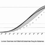
The Lorenz curve is a graphical representation of wealth or income distribution within a population. It displays the cumulative percentage of total income received by the corresponding cumulative percentage of households.
In a completely equal society, the Lorenz curve would be a straight diagonal line, known as the line of perfect equality. However, in reality, wealth distribution is usually unequal, resulting in a curve that lies below this line.
The further the Lorenz curve is from the line of perfect equality, the greater the income inequality within the population. The Gini coefficient is a numerical value calculated from the Lorenz curve that represents this inequality, with 0 indicating perfect equality and 1 symbolizing perfect inequality.
Understanding the Lorenz curve is crucial for policymakers and economists to assess the level of income inequality within a society. It highlights disparities and helps in devising strategies to address them, aiming for a more balanced and fair distribution of wealth among the population.
By visually depicting income distribution, the Lorenz curve serves as a powerful tool for analyzing societal equity and promoting discussions on economic policies that strive towards a more just and inclusive society.
Construction of Lorenz curve
When we dive into the construction of the Lorenz curve, we are peeling back the layers of income distribution with a precision that unveils societal realities. Picture this: you’re standing at the crossroads where math meets human experience to paint a picture of wealth gaps and disparities.
To start crafting this curve, you need data on income distribution among individuals or households within a specific population. This raw material forms the foundation upon which the Lorenz curve takes its shape, molding itself to reflect society’s economic landscape.
With your dataset in hand, sort it from lowest income to highest; imagine arranging puzzle pieces in ascending order of financial strength. Each piece represents an individual or household, their place in this lineup defining where they stand on the ladder of prosperity.
Next comes plotting these points on a graph – let’s call it our canvas of equity. The horizontal axis showcases cumulative proportions of people sorted by income while the vertical axis reveals cumulative shares of total income held by those corresponding groups.
As you connect these dots, a line emerges – elegant yet telling. It swoops across our graph, revealing slopes and curves that whisper tales of economic inequality and fairness—or lack thereof. Here lies the heart of the Lorenz curve: its ability to visually capture how unevenly resources are distributed among members of a community.
The curvature tells us volumes about who holds most tightly to wealth’s reins and who grapples with mere scraps—a visual narrative etched with societal nuances and injustices. With each bend and turn, we witness not just numbers but lives intertwined with fiscal fortune or futility.
And as this line dances across our graph—sometimes steepening sharply before easing into gentler inclines—we feel more than mathematical elegance; we sense human stories echoing through statistical subtleties. The Lorenz curve becomes more than lines and axes—it transforms into a mirror reflecting back society’s struggles for parity or grappling with imbalances laid bare for all to see.
Definition of Lorenz curve
Have you ever heard of the Lorenz curve? It’s like a map that shows how income or wealth is distributed in a country. Let me break it down for you.
Imagine a country where everyone earns exactly the same amount of money. In this utopian land, the Lorenz curve would be a straight line – because each person holds an equal share of the total income. But reality isn’t that simple, right?
In most countries, income distribution is unequal. Some people are rolling in cash while others struggle to make ends meet. The Lorenz curve reveals this disparity visually by plotting cumulative percentages of income against cumulative percentages of recipients.
Picture this: on the x-axis, we have households ranked from poorest to richest. On the y-axis, we show what portion of total income they earn cumulatively as we move along the line – with everyone starting at zero and ending up at 100%.
Now here comes the twist – when there’s perfect equality (like our initial scenario), the Lorenz curve aligns perfectly with that diagonal straight line I mentioned earlier. But in real life, it curves away from that idealistic marker showcasing inequality vividly.
The more bowed-outwards it gets towards the upper-right corner, indicating greater inequality; conversely less curvature signifies fairer distribution within society.
By looking at this visual representation – policymakers can grasp social disparities better than dense reports or raw data tables could convey alone.
Let’s stir some emotions into this mix now! Picture yourself standing alongside someone barely scraping by while gazing up at those living luxuriously atop their ivory towers displayed starkly on this twisted graph.
It’s not just numbers anymore; these are real lives affected by policies shaping economic outcomes reflected in every bend and turn along that curvy path laid out before us all!
So next time you come across a Lorenz curve analysis – remember it’s not just lines on paper but rather a powerful portrayal revealing stories untold about societal divisions amidst abundance and scarcity coexisting side by side.
Interpretation of Lorenz curve
When looking at a Lorenz curve, you’re peering into the heart of inequality. This graph doesn’t just show numbers; it tells a story of disparities and dreams deferred. Picture two axes intersecting like crossing paths in life: one for cumulative income or wealth, the other representing the population percentiles from poorest to richest. The line on this chart reveals how skewed distributions can be – whether everyone shares equally or if one person holds everything.
Imagine a world where each person earns an equal share – a utopia of economic balance reflected by a straight 45-degree line shooting up symmetrically. But reality isn’t so kind; instead, we see curves meandering away from that ideal slope, bending towards the wealthiest few while leaving many behind.
To interpret these curves is to grasp society’s pulse – feeling its beat quicken with every inch deviation from equality. The further that curve bows outward, the louder cries of injustice ring in our ears. It’s not just about numbers on axes but lives lived askew by systems where some thrive while others merely survive.
You might catch yourself holding your breath as you follow that line snaking across the graph paper, leading you through twists and turns mirroring actual lives impacted by uneven opportunities and privilege gaps widening like chasms between social classes.
In those moments when studying Lorenz curves, emotions bubble up unbidden – anger at inequities starkly laid bare, empathy for those struggling below curved lines climbing ever higher out of reach. These are more than mere mathematical abstractions; they carry weighty narratives etched in ink on paper yet rooted deeply in real-world struggles for fairness and justice.
As you delve deeper into interpreting Lorenz curves’ implications, remember: behind every data point lies someone’s story woven intricately into fabric society wears unequally distributed among its members. And perhaps therein lies our call to action – not just analyzing trends but advocating change toward creating a more equitable future where everyone has their place under the sun without shadows cast by skewed distributions haunting us all.
(Gini Coefficient and Lorenz Curve)
Limitations of Lorenz curve
The Lorenz curve, with its elegant swoop across a graph, tells a story of income distribution in society. It’s like a visual representation of the haves and have-nots, showing how wealth is shared – or not shared. But just like any tool, it has its limitations that can’t be ignored.
One big limitation of the Lorenz curve is that it provides only a snapshot in time. It freezes a moment when incomes are measured and plotted, failing to capture changes over time. Society is dynamic; fortunes shift, jobs come and go, economies rise and fall – all these movements escape the static nature of the Lorenz curve.
Another drawback lies in its inability to reveal the sources of income inequality. The curve showcases disparities but doesn’t delve into why they exist. Factors such as education levels, social policies, discrimination, and even luck play pivotal roles in shaping income gaps. The Lorenz curve offers no insight into these underlying causes.
Furthermore, this curve assumes homogeneity within groups – an oversimplification at best. People aren’t uniform entities; each individual comes with unique circumstances influencing their economic status. By glossing over this diversity within groups, the Lorenz curve masks important nuances that could impact policy decisions aiming for more equitable societies.
Moreover, defining “income” solely through monetary terms limits our understanding of well-being. Non-monetary factors like access to healthcare, quality education opportunities or safe living environments profoundly shape one’s standard of living but remain invisible on the Lorenz curve canvas.
Despite these limitations casting shadows upon its accuracy and depth insights regarding inequalities’ roots or comprehensive understanding beyond financial realms: respect must still be given towards this evocative line swooping across graphs – capturing so poignantly humanity’s diverse tapestry painted vividly by life choices yet constrained analytical tools fiercely elegant simplicity demands attention underpinned complexities lurking beneath superficial beauty displayed cruel truth..
Purpose of Lorenz curve
The Lorenz curve, a graphical representation used in economics, is crucial for understanding income distribution within a population. Imagine you’re at a carnival where everyone gets different amounts of tickets. Some win big prizes and receive many tickets while others only get a few. This uneven distribution mirrors real-world income inequality.
Now, the purpose of the Lorenz curve is to visually show this disparity by plotting cumulative percentages of income against the cumulative percentage of people or households who receive that income. It’s like painting a picture with numbers – each point on the curve reveals how wealth is distributed across society.
This curve can evoke strong emotions because it lays bare economic injustice. As you trace its line, you see if wealth is concentrated in the hands of just a few or spread more evenly among many. The steeper the curve, the greater the inequality; conversely, if it hugs closer to equality (the diagonal line), then there’s fairer distribution.
When researchers study this graph, they delve into questions about societal equity and fairness – topics that stir up passionate debates worldwide. Should everyone have an equal slice of the pie? Or should those who work harder earn more? These are not just academic queries but touch on fundamental human values and beliefs.
By analyzing data through the lens of the Lorenz curve, policymakers can make informed decisions about taxation policies or social welfare programs aimed at bridging gaps between rich and poor. The shape of this graph guides them towards creating more balanced societies where opportunities are not determined by birthright but by effort and merit.
In essence, behind its simple curved lines lies a complex narrative about power dynamics in our communities – who holds economic influence and how resources flow from one hand to another shapes our collective future.
So next time you come across a Lorenz curve in your studies or research papers, remember it’s not just lines on paper; it’s a reflection of real lives impacted by economic forces beyond their control.


