The Lorenz curve is a tool to show income distribution. It compares actual data against perfect equality. If a line is perfect equality, the closer the Lorenz curve fits the line, the fairer the income distribution. The further away, the greater the income inequality. People use it to examine gaps in wealth distribution and social equity. Policymakers can target interventions better by understanding income inequality patterns. The Lorenz curve visually represents societal disparities, highlighting where resources are unevenly allocated. It acts as a compass, guiding efforts towards more just and equal distribution of wealth. By analyzing it, societies can strive for greater fairness and prosperity.
Table of Contents
- Applications of Lorenz curve in measuring income inequality
- Construction of Lorenz curve
- Criticisms of using Lorenz curve.
- Definition of Lorenz curve
- Interpretation of Lorenz curve
(Lorenz Curve and Gini Coefficient Explained | Measure of Income Inequality)
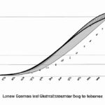
The Lorenz curve provides a visual representation of income distribution within a population. It compares the cumulative percentage of total income received with the cumulative percentage of the population. A perfectly equal society would have a diagonal line, while a more unequal society would curve away from the diagonal. Economists use the Gini coefficient to quantify the extent of inequality represented by the Lorenz curve. The Gini coefficient ranges from 0 (perfect equality) to 1 (perfect inequality). By analyzing the Lorenz curve and Gini coefficient, policymakers can better understand income disparities within a society. This information is crucial for designing effective social welfare programs and policies. For example, a steeply curved Lorenz curve and high Gini coefficient indicate significant income inequality, prompting policymakers to implement redistributive measures. On the other hand, a flatter curve and lower coefficient suggest a more equitable distribution of income. Understanding and addressing income inequality is vital for promoting social justice and sustainable economic growth. The Lorenz curve is a powerful tool that helps policymakers make informed decisions to create a fairer society for all.
Applications of Lorenz curve in measuring income inequality
The Lorenz curve is like a map, revealing the landscape of income distribution in society. Imagine standing on a hill, looking down at a valley where some households are thriving in mansions while others struggle to make ends meet in modest homes. The curve showcases this disparity vividly.
As you trace the curve delicately with your finger, you see how it bows away from the line of perfect equality, reflecting the unequal distribution of income. It’s not just about numbers; it’s about people and their stories woven into the fabric of society.
When economists analyze this curve, they can calculate a numerical summary called the Gini coefficient. This number quantifies inequality succinctly – a higher value indicating greater inequality within that economic system.
Applications of the Lorenz curve extend beyond mere statistics; they delve into real-world implications. Policymakers refer to these curves when designing social programs aimed at redistributing wealth more equitably among citizens.
Picture a single mother working two jobs to support her children – she falls below the 45-degree diagonal line representing perfect equality on the Lorenz curve. Her struggles are etched onto that graph as policymakers study ways to uplift those marginalized by unequal income distributions.
Business leaders also find value in understanding these curves as they gauge market demand and consumer purchasing power across different segments of society. By analyzing income disparities through this lens, companies can tailor their products or services effectively to reach diverse customer demographics.
Moreover, international organizations like the World Bank use data derived from Lorenz curves to assess global poverty levels and guide efforts towards achieving sustainable development goals worldwide. These curves serve as compasses pointing towards regions most in need of intervention and aid.
In essence, behind every dip and rise on a Lorenz curve lies an individual’s hopes, dreams, struggles – painting an intricate portrait of societal well-being or unrest. Understanding these applications brings us closer to creating fairer economies where opportunities abound for all rather than being concentrated among a privileged few.
Construction of Lorenz curve
The construction of the Lorenz curve is like painting a picture of societal wealth distribution. Imagine you have a canvas representing everyone’s income lined up from the poorest to the richest. You start by plotting points on this canvas: at x=0, y=0 (where no one has any income), and at x=100, y=100 (representing total income going to 100% of people). These two extremes anchor your curve.
As you gather data on actual incomes in society, you add more points to your canvas – each point marking what proportion of income goes to what percentage of people. Connecting these dots creates a smooth line that curves away from the diagonal (which represents perfect equality) towards the top right corner, symbolizing increasing inequality.
With each addition, feelings stir within you – empathy for those struggling with meager earnings, curiosity about those enjoying vast riches. The Lorenz curve gradually reveals itself as an emotional map showing who holds power over wealth and who struggles in its shadow.
When constructing this curve, precision matters as much as emotion. Each plotted point must be exact; every connection between them purposeful. It’s not just lines on paper; it’s a reflection of real lives impacted by disparities in opportunity and access.
You feel a mix of awe and sadness witnessing how some pockets of society hoard resources while others barely scrape by. The emotions evoked fuel your commitment to advocating for fairness and justice in economic systems – using tools like Lorenz curves to shine light on hidden inequalities.
As you finalize your curve, stepping back to view it in its entirety brings both satisfaction and discomfort. It’s a visual representation of social injustice etched onto paper – demanding action rather than passive acceptance.
In conclusion, constructing a Lorenz curve isn’t merely about mathematical accuracy; it’s an act infused with humanity – capturing raw realities through abstract lines and percentages. Embrace the emotions it stirs within you as motivation to strive for a world where such stark discrepancies fade into history.
Criticisms of using Lorenz curve.
When delving into the realm of measuring income inequality, the versatile Lorenz curve often takes center stage. Its elegant form visually represents how wealth is distributed among a population — but it’s not without its critics.
One of the primary criticisms leveled against the use of the Lorenz curve lies in its simplicity. While this visual tool provides a compelling snapshot of income distribution by plotting cumulative percentages of income against cumulative proportions of individuals, detractors argue that it oversimplifies a complex issue. Income inequality is multifaceted and influenced by various socioeconomic factors beyond what can be captured in one curve.
Moreover, some critics point out that the Lorenz curve fails to account for differences in cost-of-living expenses across regions or countries. A certain level of income might afford different standards of living depending on where one resides, making direct comparisons challenging. This limitation underscores the need for supplementary measures to offer a more comprehensive understanding of economic disparities.
Another critique involves the assumptions underlying the construction and interpretation of Lorenz curves. The model assumes an ideal situation where all individuals report their incomes accurately and completely — a scenario far removed from reality given issues such as underreporting or tax evasion. Such discrepancies can skew the data used to generate these curves, potentially misrepresenting actual levels of income inequality.
Critics also raise concerns about how well-suited Lorenz curves are at capturing changes over time effectively. As economies evolve and demographic shifts occur, static representations provided by these curves may fail to reflect dynamic trends in income distribution accurately. Utilizing additional tools like Gini coefficients alongside Lorenz curves could address this concern by offering complementary insights into changing inequality patterns.
Despite these criticisms, it’s essential to recognize that while imperfect, Lorenz curves remain valuable instruments in highlighting broad trends within income distributions. When coupled with other metrics and approached with caution regarding their limitations, they serve as crucial components in our ongoing quest to understand and address issues surrounding economic inequality.
(Lorenz Curve and Gini Coefficient – Measures of Income Inequality)
Definition of Lorenz curve
When we talk about income inequality, one of the key tools used to measure and visualize this disparity is the Lorenz curve. The Lorenz curve is a graphical representation that helps us understand how wealth or income distribution in a society deviates from perfect equality.
Imagine a world where everyone earns exactly the same amount of money—it would be represented by a straight diagonal line on the graph. However, in reality, this line is often curved, showing us the actual distribution of income within a population. The further away this curve is from the diagonal line of perfect equality, the greater the income inequality.
The concept behind the Lorenz curve can tug at our heartstrings as it vividly illustrates just how unevenly resources are distributed among people. It’s not just about numbers; it’s about real lives and opportunities being affected by these disparities. Looking at a skewed Lorenz curve can evoke feelings of empathy for those who struggle with financial hardships while others enjoy abundance.
To construct a Lorenz curve, data is gathered on individuals’ incomes or wealth within a specific population. This information is then sorted from lowest to highest earners before calculating cumulative percentages against total income received. Plotting these points on a graph reveals an insightful visualization—highlighting stark contrasts between different segments of society.
As you trace along the curvature of the Lorentz Curve, you might experience moments of realization—seeing how certain groups hold disproportionate shares while others barely scrape by. Each bend and slope tells a story of societal dynamics and economic imbalances that shape our communities.
Ultimately, understanding and interpreting Lorenz curves isn’t just an academic exercise; it’s crucial for policymakers aiming to address issues around poverty, social justice, and equitable resource allocation. By delving into these graphs with both analytical precision and compassionate awareness, we can strive towards creating fairer systems that uplift all members of society.
In conclusion, diving into the realm of Lorenz curves offers more than mere mathematical insights—it opens windows to glimpses of human struggles and triumphs woven into intricate patterns across socioeconomic landscapes—a powerful reminder that behind every data point lies someone striving for dignity amidst challenging circumstances.
Interpretation of Lorenz curve
Interpreting the Lorenz curve offers a revealing glimpse into the distribution of income within a population. Picture a graph where along the x-axis, we rank individuals from poorest to richest, and on the y-axis, we plot what percentage of total income they hold. The curve starts at point (0%, 0%) and climbs as it shows how cumulative income grows with each added individual.
As you trace this line upwards on the chart, contemplate its shape – does it hug the diagonal axis closely or veer away dramatically? A curving line signifies inequality; if wealth were evenly distributed, our curve would be a perfect straight angle rising diagonally across.
When interpreting these curves emotionally for many people witnessing staggering gaps in wealth can evoke feelings of empathy or sometimes outrage. It lays bare societal disparities that may have been previously overlooked – starkly revealing who holds power and privilege versus those struggling below.
Furthermore, analyzing specific points on this graph can offer poignant insights. Imagine focusing on two particular spots: first, the Gini coefficient represents an index summarizing overall inequality based on how far removed your curve is from equality; secondly, pinpointing where your Lorenz curve intersects with that ideal diagonal tells us precisely what percent of society owns which portion of collective earnings.
Engaging with data through such visual aids stirs a powerful mix of emotions – compassion for those left behind by an unjust system alongside frustration towards structures perpetuating such inequities. These curves serve not only as analytical tools but also as mirrors reflecting back to us our values and priorities.
In essence, grappling with Lorenz curves challenges us to confront uncomfortable truths about income disparity head-on rather than turning a blind eye. It’s like holding up a magnifying glass to society’s economic landscape—revealing intricate patterns beneath its surface complexities while stirring passions within us to strive for more fairness and equity.


