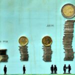
The story of the Gini Coefficient began in 1912 when Italian statistician Corrado Gini first introduced it. Gini developed this measure to track income distribution within a population, aiming to capture inequality levels effectively. Over time, it gained popularity globally, becoming a vital tool in analyzing societal disparities. Economists widely adopted the Gini Coefficient due to its simplicity and robustness. The coefficient ranges from 0 (perfect equality) to 1 (maximum inequality), offering insight into wealth gaps. Despite criticisms, it remains a key indicator in economic research, shaping policy decisions and social interventions worldwide. The Gini Coefficient continues to evolve, aiding in understanding and addressing income inequality.
Table of Contents
- Calculation methods of the Gini Coefficient
- Criticisms of the Gini Coefficient
- Definition of the Gini Coefficient
- Development of the Gini Coefficient over time
- Real-world applications of the Gini Coefficient
(Understanding the Gini Coefficient)
The Gini Coefficient, named after Italian statistician Corrado Gini, measures income distribution within a population. It ranges from 0 (perfect equality) to 1 (perfect inequality). Gini’s work on inequality began in the early 20th century. His index was first used in 1912 to analyze wealth distribution in Italy. The Gini Coefficient gained international popularity in the 1950s. Economists and policymakers embraced it to evaluate inequality across different countries. The coefficient provides a snapshot of social and economic disparities. It highlights the gap between the rich and the poor. The Gini Coefficient remains a valuable tool for policymakers worldwide. It helps in designing effective policies for poverty alleviation. Over time, it has become a widely accepted measure of inequality. Despite criticisms, the Gini remains a crucial aspect of social and economic analysis. Its history reflects the ongoing efforts to address inequality and promote fairness. The Gini Coefficient stands as a symbol of the quest for a more equitable society. Its impact continues to shape discussions on social justice and economic development.
Calculation methods of the Gini Coefficient
In the realm of income inequality measurement, the Gini coefficient stands as a key player. Its calculation methods are intricate yet vital in painting a picture of societal wealth distribution. The journey to quantify this disparity has been an evolving one, marked by various approaches and refinements.
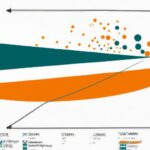
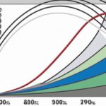
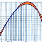
The most common method for calculating the Gini coefficient involves plotting cumulative income shares against cumulative population percentages on a Lorenz curve. This graphical representation offers insight into how unequally income is distributed among a population. Imagine data points scattered across a graph, forming a line that showcases the earnings gap between the affluent and less privileged.
To derive the numerical value of the Gini coefficient from this curve, economists employ integral calculus—a tool that dives deep into mathematical intricacies to unveil patterns within datasets. It’s like unraveling a complex puzzle where each solution reveals another layer of societal wealth structure.
While these methodologies provide valuable insights, they also carry limitations and assumptions inherent in any statistical analysis. Emotions may run high when confronting stark inequities laid bare by numbers on paper—anger at systemic injustices or perhaps motivation to advocate for change pulsing through those who analyze such figures.
Over time, advancements in technology have facilitated more sophisticated calculations of the Gini coefficient, allowing researchers to crunch vast amounts of data with greater precision and speed than ever before. These innovations open doors to deeper examinations of socioeconomic disparities across regions and demographics—an emotional rollercoaster ride as we confront harsh realities but also unearth opportunities for targeted interventions.
Despite its complexities and limitations, the Gini coefficient remains a powerful tool in assessing economic inequality—a lens through which we can scrutinize societal structures and advocate for policies promoting fairness and inclusivity. As we continue refining our understanding of wealth distribution dynamics, each calculation method employed serves as a stepping stone towards building a more equitable world—one number at a time.
Criticisms of the Gini Coefficient
The Gini Coefficient, a measure of income inequality developed by Italian statistician Corrado Gini in 1912, has been a pivotal tool in understanding wealth distribution. However, like any metric, it is not without its flaws and criticisms.
One significant criticism of the Gini Coefficient is that it oversimplifies complex economic realities. In its essence, the coefficient condenses an entire distribution curve into a single number between 0 (perfect equality) and 1 (maximal inequality). This reduction can overlook important nuances within different income brackets and regions. It fails to capture factors such as wealth discrepancies among various social groups or disparities in access to resources.
Moreover, detractors argue that the Gini Coefficient lacks sensitivity to changes over time. Since it provides a snapshot at one point in time, it may not accurately reflect dynamic shifts in income distributions or societal progress towards greater equality. A fluctuation in the coefficient might be misinterpreted without considering underlying reasons for the change.
Another critique targets the assumption that all individuals are equal within their respective income brackets when calculating the index. This simplification disregards variations within these groups—the rich-poor divide does not account for differences among high-income earners themselves or those living below poverty lines but still experiencing degrees of deprivation.
Critics also question whether focusing solely on income inequality neglects other crucial aspects of well-being and social welfare. Factors like healthcare accessibility, educational opportunities, and quality of life indicators contribute significantly to overall prosperity but fall outside the scope of traditional measures like the Gini Coefficient.
Despite these criticisms, proponents argue that while imperfect, the Gini Coefficient remains a valuable instrument for highlighting disparities across populations and guiding policy interventions aimed at addressing inequality. By acknowledging its limitations alongside strengths, researchers can develop more comprehensive approaches to studying economic stratification and advocating for inclusive growth policies—emphasizing both statistical rigor and empathetic understanding of human experiences amid diverse socio-economic landscapes.
Definition of the Gini Coefficient
The Gini coefficient is like a magnifying glass for income inequality. It’s this nifty number that condenses all the disparities in wealth within a population into one simple statistic. Picture it as a spotlight shining on the gap between the haves and have-nots.
Imagine you’re at a party with ten friends, and everyone’s sharing snacks. If one person ends up with most of the chips while others are left munching on crumbs, that situation reflects high income inequality – exactly what the Gini coefficient reveals.
Derived by an Italian statistician named Corrado Gini back in 1912, this metric has become crucial in understanding economic disparity worldwide. Think of it as a storyteller whispering secrets about societal wealth distribution – who holds power, who struggles to make ends meet.
When we talk about the Gini coefficient hovering close to zero, it signals near-perfect equality among individuals when it comes to their financial status. In contrast, if the score edges towards one hundred (the highest point), brace yourself for major gaps where money pools at one end while trickling down sparsely elsewhere.
Now let’s delve deeper into how this magic number is calculated: statisticians weave complex mathematical formulas using data from household incomes or consumption levels across a population. They sift through earnings like skilled detectives hunting for clues about social equity or injustice lurking beneath everyday transactions.
The beauty lies in its simplicity yet profound impact – revealing glaring truths often overlooked amidst daily life routines. The numbers don’t lie; they paint stark pictures of privilege and poverty side by side on society’s canvas.
And here’s where emotions come into play – when confronted with these stats showing wide gulfs between different segments of society, our hearts can’t help but ache for those left behind without access to opportunities or resources needed to thrive.
In essence, the history of the Gini coefficient isn’t just dry facts and figures; it’s a vivid narrative tracing human struggles against an uneven playing field in pursuit of fairness and justice for all. So next time you hear someone mention “Gini,” remember it’s more than just math—it’s a window into our shared hopes and dreams for a world where everyone gets their fair slice of pie.
(Lorenz Curve and Gini Coefficient – Measures of Income Inequality)
Development of the Gini Coefficient over time
The history of the Gini Coefficient is a fascinating journey that sheds light on income inequality trends over time. One key aspect that stands out is the development of this measure, known for its ability to quantify disparities in wealth distribution within a population.
Initially proposed by Italian statistician Corrado Gini in 1912, this coefficient gained prominence as a tool to assess economic equity. Over the years, it evolved into a crucial metric used not only by economists but also policymakers and social scientists worldwide.
As decades passed, data collection methods improved, allowing for more accurate calculations of the Gini Coefficient across different regions and countries. This led to deeper insights into societal structures and how wealth was distributed among various segments of populations.
In the mid-20th century, during periods marked by significant socio-economic changes globally, fluctuations in the Gini Coefficient were observed. Times of economic prosperity often correlated with lower levels of income inequality, while recessions or financial crises tended to widen the gap between rich and poor.
The emotional impact of these findings cannot be understated – witnessing firsthand how an abstract mathematical concept like the Gini Coefficient reflects real-world struggles faced by individuals can evoke empathy and drive towards addressing systemic inequalities.
With globalization reshaping economies around the world in recent decades, discussions around income inequality have taken center stage. The Gini Coefficient serves as a vital compass guiding efforts to understand complex wealth distribution patterns amidst rapid transformations affecting societies at large.
Today, as we navigate an era characterized by digital disruptions and evolving socio-political landscapes, tracking changes in the Gini Coefficient remains essential for shaping inclusive policies aimed at fostering equitable growth opportunities for all members of society.
In conclusion, exploring the trajectory of the Gini Coefficient over time unveils not just statistical trends but also profound narratives reflecting human experiences impacted by disparities in wealth distribution. By delving deeper into these stories echoed through data points lies our potential to create meaningful change towards building fairer societies where every individual has a chance to thrive regardless of their background or circumstances.
Real-world applications of the Gini Coefficient
The Gini Coefficient, a measure of income inequality named after Italian statistician Corrado Gini, has found its way into various real-world applications that impact our daily lives. From economic policies to social programs, this statistical tool plays a crucial role in shaping decisions around the distribution of resources and opportunities.
Picture this: policymakers in a bustling metropolis are grappling with how to allocate funds for public services effectively. They turn to the Gini Coefficient as their compass, guiding them on where income disparities exist within the city’s diverse neighborhoods. By analyzing these disparities, they can pinpoint areas most in need of enhanced infrastructure or targeted support programs, ensuring resources are allocated equitably.
In the realm of healthcare, imagine a team of researchers studying access to medical services across different regions. By leveraging the Gini Coefficient, they can assess how income inequality impacts individuals’ ability to afford quality healthcare. This data-driven approach allows them to identify gaps in accessibility and advocate for policies that aim to level the playing field for all members of society.
Now shift your focus to education—a cornerstone of societal advancement. School districts use the Gini Coefficient to evaluate student performance based on socioeconomic backgrounds. By understanding how income inequality affects educational outcomes, educators can tailor interventions such as tutoring programs or scholarship initiatives to bridge the gap and provide equal learning opportunities for every child regardless of their financial circumstances.
On an international scale, organizations like the World Bank utilize the Gini Coefficient to compare income distribution among countries worldwide. This comparative analysis sheds light on global economic disparities and informs strategies aimed at promoting sustainable development and reducing poverty levels across borders—creating ripples of change that reach far beyond individual nations.
As we navigate through complex societal challenges, from poverty alleviation to resource allocation and beyond, the humble yet powerful Gini Coefficient stands as a beacon illuminating paths towards more equitable futures for all. Its versatile applications underscore its significance not just as a statistical metric but as a catalyst for meaningful change rooted in empathy and solidarity.